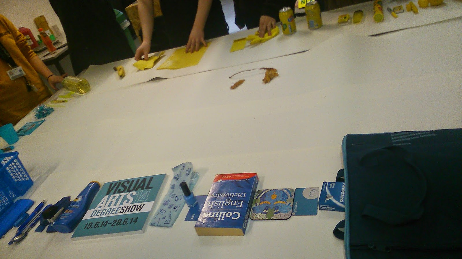
Last week we were given a specific colour, either red, yellow or blue, and were told to each bring 5 items of that colour into this session, and wear one item of clothing in that colour as well.
We had a set of tasks we had to complete using our different items, and the first one was to organise our items in a line from dark to light colours. This proved a lot more difficult than I first thought to do, as you not only have to consider colours in general, but shades and warmths of colours as well, which gets a bit complicated.
 |
| We had a bit of trouble figuring out which was the lightest item, as although one shade might be lighter than another, the saturation of that colour might be darker, which gets confusing. Here we were puzzled over the blue tac and the nail varnish. I think that although the nail varnish is a lighter shade than the blue tac, it's saturation is much greater so it's in the correct position. |
 |
| This is what the majority of the group decided on as out final layout. I disagree with the nail varnish and blue tac, although I can see what other people mean why they chose to put it in this order. |
We then had to rotate tables and my group went to the yellow table, and we had to look at how they had organised their coloured items, and see if we would change anything about it.
 |
| This is their original layout. |
 |
| We thought that they had put the sponge you see here too far up the darker end of the scale, and instead we thought it worked better next to the banana, as although the shade itself doesn't fit in here, the colour saturation does, as as a colour it is quite light and similar to the banana. |
 |
| This is our finished layout. We didn't change much, the sponge was the main obstacle we came across. |
 |
| Same layout only from the dark end. |
We then went back to our own table and looked at how the red group had changed how we had organised our items. This was interesting to see how other people see colours, in the way they had changed our organisation.
 |
| One thing they had changed was the laptop case and the canvas bag. The canvas bag is darker in shade, however the laptop bag us darker in it's saturation of it's colour. I feel that the red group were right to make this change. |
 |
| One thing I was very happy they changed round was the nail varnish and blue tac. They, like me, thought that the blue tac was a lighter overall colour than the nail varnish. |
 |
| This is the changed layout of our coloured items from light to dark. |
Our next task was to arrange our coloured items from warm colours to cool colours in a circle. This task we were really confused about what a cold colour looked like and what a warm colour looked like, so our tutor gave us this method of figuring this out, using yellow blue and yellow pieces of paper. If they item looked more blue then it was a cold colour, but if it had more yellow pigments in it then it was a warm colour.
 |
| How we decided if a colour was cold or warm. This cup is a warm colour because it has a lot of yellow in it. |
 |
| We started off by separating the items into cold colours, warm colour and mixed colours. We found that a lot of our items were in the mixed or warm category, which was strange because initially you think of blue as a very cold colour. |
 |
| We then arranged our items into a circle, so they went from warm to cool to warm again, from the warmest to the coolest. At the top end of the photograph are the warm colours, and at the bottom are the cool colours. We found it a lot easier to organise them once we arranged them in a circle, matching one item against a variety of other items in that part of the circle to see if it fit in. |
We then had to take one item from our colour circle and take it to the red group and fit our blue item into their red circle going from warm to cool, based not on colour but how warm or cool the item was.
 |
| This was the red groups initial colour circle. They had arranged it in lots of different circles, so on the outside circle were all the cool colours, and on the inside circle were all the warm colours. |
 |
| This is a great example of how a blue calculator matches pretty much perfectly the warmth of this book, even though they are two completely different colours. |
 |
| This Nivea hand cream also fits in really well against the scarf and lipstick, having a lot of red in it's colouring. |
 |
| This is how we put all our items into their colour circle. I feel we managed to fit them in without too much difficulty. |
 |
| We then went back to our blue table to see how they yellow group had fitted their colours into our colour circle, and I think they have matched them really well. |
We then had to take our warm to cool colour circle and join it with the yellow and blue colour circles to make one giant colour circle going from yellow to red to blue.
 |
| Red and yellow end of the table, going from warm red to cool red to cool yellow. |
 |
| Blue and yellow end of the table going from warm yellow to warm blue to cool blue. |
 |
| This is the best shot of the whole table I could manage, as the table was very long and it was really hard to get everything in stood so close to it. I think as a group we have all managed to combine our colour circles with the other two and manage to organise everything correctly. |
I think that this task today has really helped expand my knowledge of colour, and how one colour might look really similar to another, but in fact it would have a completely different effect. This will help me a lot when choosing colours for my studio brief outcomes.


No comments:
Post a Comment