My next stage was now to actually produce this idea, and I started off by taking my own photographs of broccoli to use, instead of taking photographs off the internet.
 |
| This is the original photograph I used, which I chose from a couple of other photographs which were pretty much identical, however I thought that this photograph was the clearest and had the least amount of shade on it. |
I then uploaded this photograph to Photoshop and cropped it so that there was only a small border around the broccoli instead of a great expanse of space. I then used the magic wand tool to delete the background, so that the only object in the photograph was the broccoli itself. I then adjusted the colour of the broccoli several times, so that it still looked natural, but was just different shades of green, because there isn't one tree that is the same colour exactly as another. These are my results.
 |
| Variant one. |
 |
| Variant two. |
 |
| Variant three. |
 |
| Variant four. |
 |
| Variant five. |
 |
| Original cropped photograph. |
I then opened a new document, this time on Illustrator and uploaded the lungs drawing from previous experiments to it, dimming the image to 30% and putting it on it's own locked layer. I then opened each variant of broccoli to this document as well and copied them over and over to fit in the whole of the lungs, only leaving the bronchioles branches clear.
 |
| Here I have finished one side of the lungs, and I am very pleased with how it has turned out. I have managed to create a very varied mix of colours with the use of 6 different shades of broccoli. I think the broccoli photographs also look really similar to trees as well, which was what I was aiming for. |
 |
| This is the same lung as previously, only without the outline to show you were the stems should be. I hid the outline to check if I could effectively and easily make out the design without the aid of outlines, as I won't have the outlines in my final piece. |
 |
| I then created the main bronchus stem outline using trees, so that both sides of the lungs would be joined. |
 |
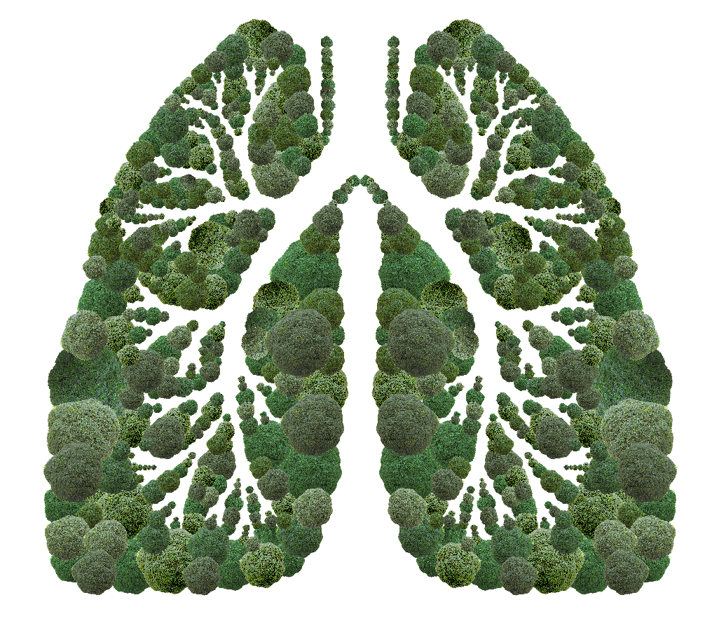
| Using the reflect tool I then copied my completed side of the lung vertically so that I had a symmetrical pair of lungs. I chose to reflect it rather than create the whole other side of the lungs in the same way I did the original side, because I thought that it would save me time, as I still have to produce my other two backing paper designs. I think that it is actually really effective, and I don't think it matters that it is symmetrical. |
 |
| This is my final design. The only alterations I have made are that I have added an extra broccoli to the joint of the two lungs to make it more pointed, and I have extended the main bronchus stem upwards so that it is higher than the top of the lungs, making it look more natural. |
 |
| After finishing my main image for this backing paper design, I then thought about the layout of the elements other than the image on the backing paper, such as frame dimensions and any other text I want on the backing paper. I experimented with many different layouts by sketching them out, and then I will next create them digitally as well. |
Following on from this experimentation with the poster layout I then started digitalising these page layouts to see what they look like with the proportions all correct.
 |
| This was my initial layout, just deciding what text to actually use. I chose to incorporate a quote that was on one of the posters I researched, as I thought this was really inspiring and relevant to this backing paper. |
I experimented with loads of different background colours, as initially I thought that a white background was perhaps a bit too plain.
 |
| I thought that this green was too bright. |
 |
| This shade of green was a suitable brightness for the poster, although I don;t think it adds anything to the design of the poster. |
 |
| I then went for an extremely bright colour green, and this makes the lungs look awful, as the shades of green don't mix well at all. |
 |
| I then tried a slightly more yellow shade to make the design look warmer, however I don't think this works either, it makes the lungs less prominent. |
 |
| Then I tried a more lime green shade, as I thought perhaps the other shades I was using were too warm against the lungs cold shades. |
 |
| I tried a blue next to make the bronchiole branches in the lungs look like rivers, although I think that this shade of blue doesn't look right against the lungs, it looks too fluorescent. |
After all this experimentation with different coloured backgrounds I came to the conclusion that a coloured background just wasn't going to work as well as I had anticipated it would, and that the white background is the most effective after all.
 |
| This works as a layout however it looks a bit too bottom heavy. |
 |
| I tried this layout, which is pretty similar to the previous one, however again I think it is still too bottom heavy, although the triangle formation that is made is rather appealing. |
 |
| I like this layout, I think it works really well and is well balanced, however I think the title at the top isn't as impactful as it could be. |
 |
| This is a lot bolder, however now I think it's too top heavy. |
 |
| I think this is a better balanced layout, however the quote is highlighted as one of the most important things you read when it shouldn't be. |
 |
| Here I tried a very different kind of layout, with the quote small on the left and the dimensions small on the right. I think this layout just looks really weird however and forced. |
 |
| This is very similar to the one above only everything is on the left hand side. I don't think this layout works either as it is much too left heavy and imbalanced. |
 |
| Here I tried with the dimensions all on one line, which I really like and think this works much better than it being in a stack. |
 |
| The quote in this layout appears almost as a piece of information for the image. I don't think this works as it makes the layout look wok sided |
 |
| This layout looks like it's getting more to how I would like it. It is laid out in order of importance and appears very neat and tidy. If anything thought I would say the the dimensions look a bit lonely at the bottom, and everything at the top looks a bit too friendly. |
 |
| I kept the same layout as previously only I have made the quote into two lines and aligned to the left. I don't like how it has turned out however as it looks imbalanced and just not right. |
 |
| This layout is completely wrong, with the quote spanning exactly the width of the backing paper and the title below it. This is in entirely the wrong order and therefore makes the design look out of place. |
 |
| I tried putting just the title at the bottom and leaving the quote at the top on it's own. I think this does work a bit better, however I still don't think it looks effortless. |
 |
| Perhaps making the quote into two lines on the top row aligned to the left would make it look better, although I really don't think it does, it still looks uneven and out of place. |
 |
| I experimented with a different composition of the title, to see if this makes any difference, and it does make this layout look a lot better. I still think the quote at the top looks out of place however. |
 |
| I tried this again with the quote across the whole top of the page, and again it makes it look better, but the quote still doesn't fit in with the rest of the page. |
 |
| This is my final chosen layout I think. It is well balanced and well organised, and everything has a suitable amount of impact for what it is. |
 |
| Placing the title at the top and the quote below the image at the bottom across two lines look so much better than any of my other layout designs, especially with the dimensions across one line only. |
 |
| You can't see that clearly but I changed the font colour form black to a really dark jungle green colour, to fit in with the theme of deforestation better, and to make it look less imposing. |
 |
| After I showed my final design to my peers they suggested I had "photo frame" on a row of it's own to separate it all up a bit, and after doing this I am really pleased with the layout and think it looks a lot more balanced and even now. This is my final design. |


No comments:
Post a Comment