We recently had a photography lighting induction where we had a recap on how to use the DSLR camera's, and were taught how to light a back drop effectively and different things and techniques we could use to get different images from our work. I found this quite useful, the refresher in how to use the camera's was very useful, as it had been a while since I had last used them, and I got some really nice photographs of my work, which are of just that little bit of a better quality than if I would have taken them in the studio.
Getting back into using the camera's:
 |
| As you can see it didn't start off so well. |
 |
| Again, not brilliant. |
 |
| When I finally managed to take a photograph, it came out very blue. |
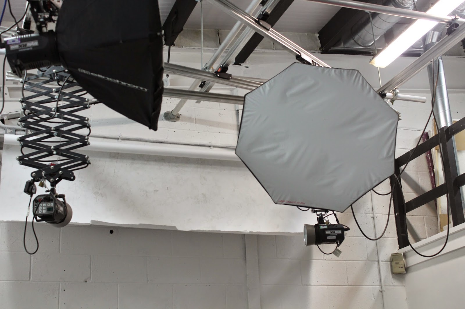 |
| I then changed some settings on the camera, including the white balance, and this was fixed. |
I found a very nice looking piece of wire dangling over a rail, which belonged to a set of headphones. I thought the way the wire curved and bent was really interesting, especially the contrast of the black wire against the vaguely colourful backdrop.
I thought the LED lighting on parts of the ceiling looked very industrial and urbanised, and thought the contrast of bright white or pink colours against the pipework was very interesting.
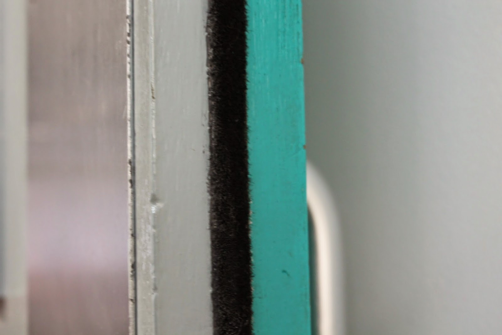 |
| The side of a door. I thought the contrast in colours and textures looked interesting. |
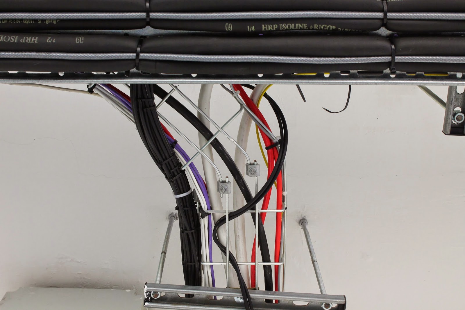 |
| Again I became fascinated with cable's, the contrasting colours, and the way they all bend together. |
 |
| The inside of a giant radiator. I thought the detail on the inside was interesting, how bumpy it was, and thought I could capture a tunnel like image, which I feel I have, the focus on the end of it. |
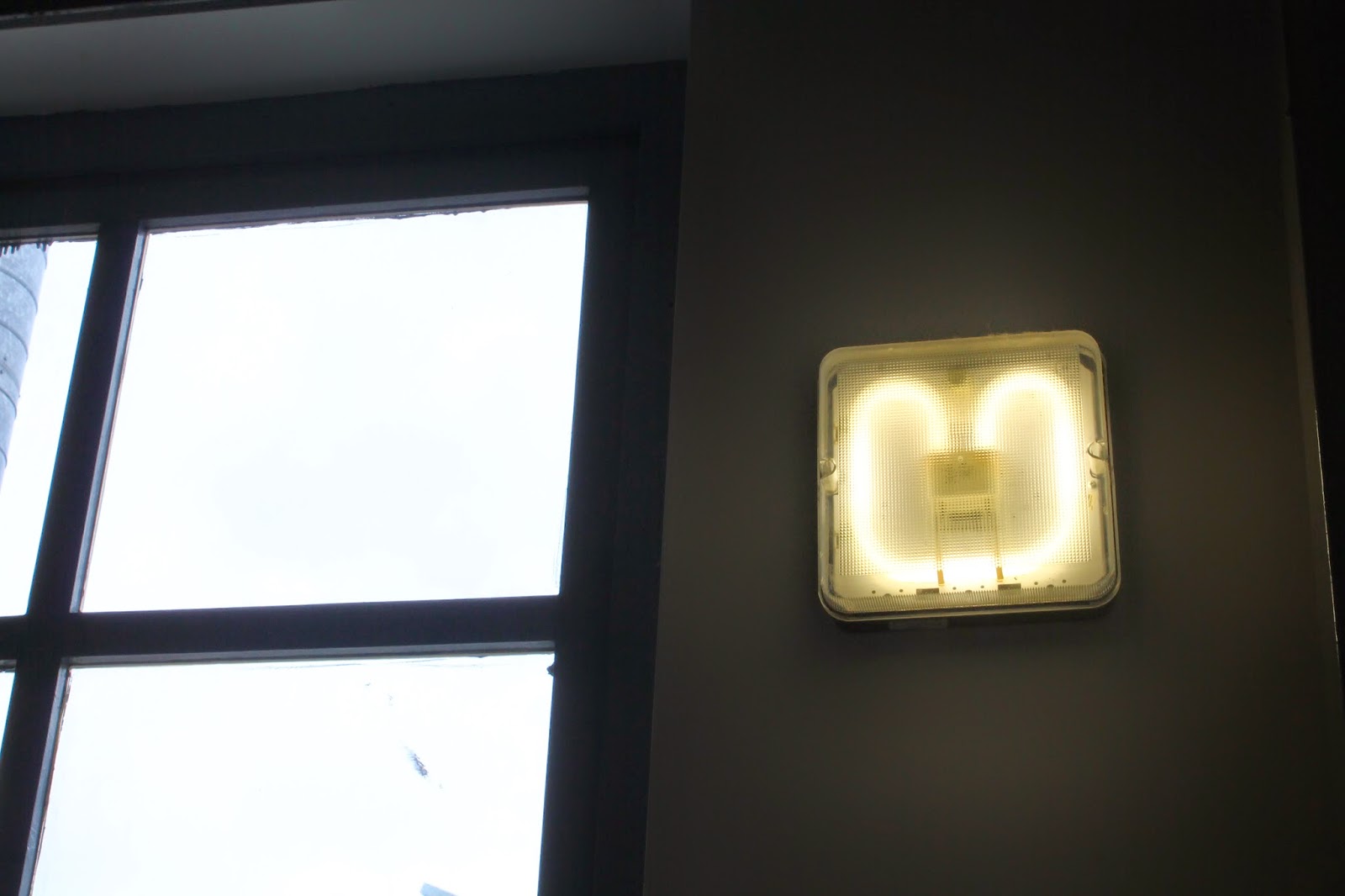 |
| Again with the lighting, I liked how the LED light curved around the box, creating as much light as possible in the small space. I also liked the contrasting dark and light colours too. |
 |
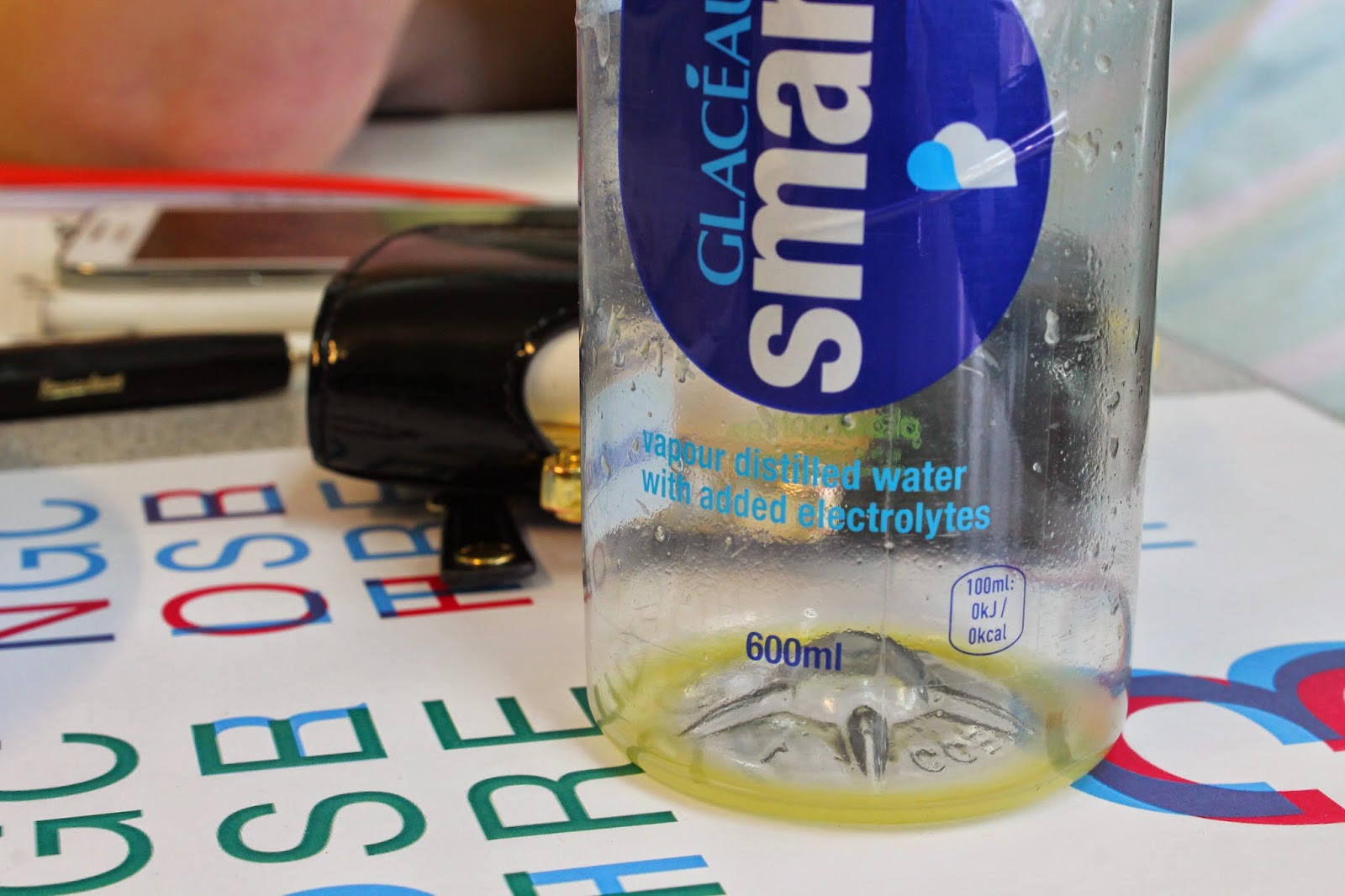
| I thought how the water bottle crinkles looks quite interesting, the creases in it, and thought this would look interesting when photographed. |
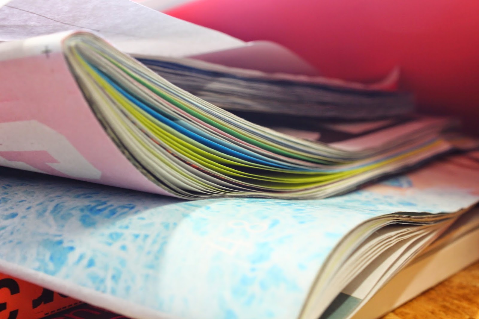 |
| I liked the different coloured stock being shown from inside one booklet, how all the colours shown in this photograph are vibrant and pastel shades, working really nicely together. |
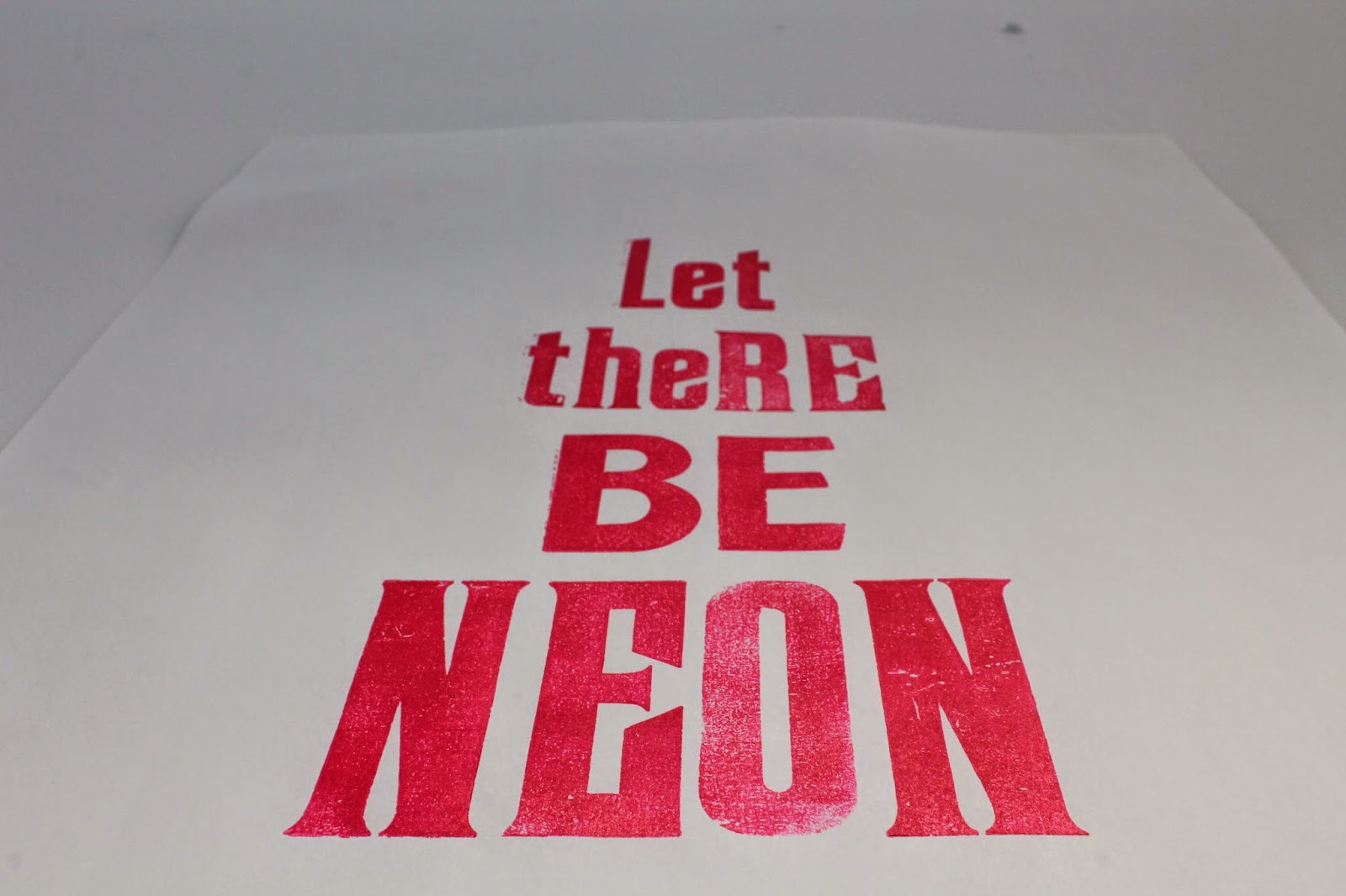 |
| I thought this was a very powerful statement, and wanted to emphasise this by taking the shot from below. |
Photographing my work:
We then moved back into the studio, and were put in pairs to set up the lighting set up, involving two standing lights, a table to put our work on, a frame to hold the coloured paper, and the paper itself to be the background colour. There were also umbrellas over the standing lights so that the light wasn't too blinding and harsh. There was also this silver and gold reflective circle which we could position to get a different warmth in colour for our work if we wanted, or to help reflecting the light onto our work in different ways. I found this very useful for my Interesting Destinations book, which I found needed a bit more intricate lighting to bring out the colours best. To make sure that the white balance was correct and the same for each photograph, we had a grey coloured piece of card we had to place under the lights and photograph, then set the white balance to that piece of card, which gave us a very accurate, consistent appearance to our photographs.
The photographs:
I thought I managed to take some very professional looking photographs of two sets of my outcomes, which will prove very useful for my design boards and presenting these as the final outcomes. After a lot of experimentation outside the studio, once I came back in I found it surprisingly easy to take effective photographs. Now that I have undergone this induction, I can now book a studio and take photographs of my work whenever I need to, which will be really useful perhaps just before module submissions to make sure I have all my final pieces photographed professionally ready for submission, or to put on my blog or website so that other people can see my standard of working as well.




No comments:
Post a Comment