Olympic City Project
The Olympic City Project is an ongoing project by Jon Pack and Gary Hustwit, documenting photography from the legacy of the Olympic Games in previous host cities. It documents what happens to the host cities after the Olympics is over, how they use the stadias, or if they just fall into ruin.
The photographs have been assorted and published in a 240 page limited edition book, featuring around 200 photographs from the project, which was designed by graphic designer
Paul Sahre.
The photographs
 |
| Igman Olympic Jumps - Sarajevo. |
 |
| Olimpic Bar - Barcelona. |
 |
| Adirondack Correctional Facility - Lake Placid. |
 |
| Olympic Stadium - Helsinki. |
 |
| Montjuic High Dive - Barcelona. |
 |
| Olimpic Wall - Sarajevo. |
 |
| Olympic Village - Rome. |
 |
| Igman Olympic Ski Jumps - Sarajevo. |
 |
| 1936 Olympic Village - Berlin. |
 |
| Cafe Lympic - London. |
The Book
The Olympic City Project's photographs have also been complied together to produce a limited edition hardcover book.
 |
| As you can see the front cover is very simple, with a cloth cover with the names of the host cities printed onto it. The cover is very cheerful looking being sunshine yellow and the text in white. This could also reflect the gold medals athletes receive at the events. |
 |
| The photographs are centrally aligned to each page, with margins around each edge of the page, allowing the photograph to be held in the page, but isn't so small that it gets lost in the space. The yellow cloth bound cover can be seen around the edges of the pages, almost framing the double page spread nicely, and creating a great contrast to the slightly run down, murky quality of the photographs. This also reflects the previous host cities and how they have developed after the Olympics, as some have gone from strength to strength and others have deteriorated. |
 |
| To fill blank pages these pages have simply been filled with a block colour, which helps to emphasise the photograph on the opposite page, by leading your eye to that page as that's where all the detail is. |
Disengaged by Amelia Lonsdale
This is a book produced by Amelia Lonsdale, a fellow Leeds College of Art student studying Photography. This project researches the people of Doncaster's opinions and thoughts of the changes Doncaster is going through during the run up to the 2015 General Election.
The books general appearance is very stark and clinical, with the photographs being the main focus of each page, taking up the most space, and being the only colour source throughout the book. The photographs have a run down appearance to them, with a lot of the landscape photographs being of dilapidated buildings or of run down parts of Doncaster. This shows the state that Doncaster is in, or what previous General Elections have done to the city.
The minimal style of the book combined with run down, not very vibrant looking photographs is similar in style to the Olympic City Project book and it's photographs, which is the same style I want to produce my presentation and publication in if I choose the Crumbling Kidderminster idea.
 |
| The baseline of the title of the book sits on the bottom of the photograph, so the title looks as if it is leaking into the background white colour of the front cover. The broken fence in the photograph and the unappealing fading red paint on the side of the house suggests the theme the rest of the book is going to follow, and also reflects the layout of the inside of the book, minimal yet powerful. |
 |
| This is the photograph on the inside cover of the book, which shows a map of Doncaster, the featuring place in this book. The muted colours of the map make this page look dull and unexciting, which compliment to the title of the book "Disengaged", being disconnected and unenthusiastic and upbeat. |
 |
| The book shows some prettier places in Doncaster such as this river shot, however even this more attractive photograph includes a stormy grey sky, which perfectly highlights the general mood of the book, dull. |
 |
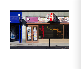
| Closed down shops are highlighted rather than shied away from, showing Doncaster's true colours and what the previous government has achieved. |
 |
| Another more run down, closed shop with letters from the sign missing, again in very dull, muted colours, showing the atmosphere in Doncaster, and not being afraid of showing off it's worst side. |
 |
| New builds are shown in this lovely photograph, looking very modern and clean, a great contrast to the peeling paint and broken signs in previous photographs of buildings. This is showing that Doncaster is making changes and improving, but maybe not in fast enough a pace to combat the rate it is falling at as well. Again these lovely new builds have a backdrop of stormy grey skies, the dull mood still clinging to the attempts of making Doncaster revitalised. |
 |
| Although a photograph of a garden centre, with bits of yellow and green creeping in in the bottom left corner, the dull grey sky and concrete floor makes this image still look very desolate (no people can be seen) and plain. |
 |
| Not a lot can make a town look more run down than these metal mesh fences shown in this photograph cornering off a building site. The grey of this fence and the grey of the sky contribute to a desolate image. Note in none of the above photographs any people can be seen, which I think adds to making this town look dull and run down, the lack of people milling around, creating a bustling atmosphere. Instead it is deserted in the photographs, even of cars, making it look a bit like a ghost town. |
 |
| Posters plastered to closed down shops are a sure sign that the place has been vacant for a while, and this shop has them all over it, which admittedly adds a bit of white colour to the black, bleak shop. |
 |
| This book is about the people of Doncaster's opinion of the upcoming election and what it means for Doncaster, so naturally there should be a photograph of the polling station in Doncaster, which is exactly what this photograph is of. I think this photograph sums up everything quite well. Boring brown bricks covering most of the photograph, and urban yellow horizontal lines signalling to parking on dull grey tarmac covering the rest of the photograph. Even looking into the polling station looks dark and uninviting, which no evidence of lights being on in the building. The sign signalling it's a polling station also couldn't be more dull being a white sign with uppercase black lettering. As simple as you could get. |
 |
| This is the kind of page layout throughout the book, with several blank white pages throughout the book to spread out the information and sections clearly. The landscape photographs are in the top section of the page, with equal margins throughout the top, left and right sides. These are also generous margins, making the image sit nicely within the page, like ti has enough space to breathe, but is still being held in place by the edges of the page. |
 |
| The people of Doncaster were the highlight of the book, with the landscape photographs only coming in occasionally, to emphasise the point the people were making. As you can see in this example spread the photographs match the landscape photographs in being rather dull and plain, using the same grey muted colours. There are small captions to accompany the photographs, commenting what each person has said about Doncaster and the upcoming election, including a little bit about the person as well. The photographs are placed in exactly the same place as the landscape photographs, so the whole book has a continuous appearance, making everything very structured and clean. The photographs are the main focus of this book, with it being a Photography project, so naturally they take up the most space within the book, the captions are merely to provide the necessary information to accompany the photographs. |
Conclusion
Both of these publications have very similar appearances, as they are both very minimal with the photographs being the main focus. The page layouts are also really similar as well, with the photographs taking up the majority of the space on the page, allowing for margins surrounding the photographs, with a minimal amount of text, allowing the photographs to speak for themselves, and for you to make your own assumptions about each photograph. This is something that I want to achieve with Crumbling Kidderminster, making the photographs the focal point of the presentation. The text should only provide the necessary information, simple and to the point. The colour palettes are all quite neutral, except for the cover on The Olympic Project, and the occasional photograph, which is something I should aim towards for Crumbling Kidderminster, creating this dull, desolate appearance, with only a few strands of light.


No comments:
Post a Comment