I surprisingly found it really easy to find interesting examples of typography for every letter of the alphabet, which reflected the image of Bewdley I was aiming to achieve, a more hand crafted, unique, middle classed one.
I found it hard in some cases to get a good photograph of some lettering, as with older buildings often the signage was a lot higher up, and with narrow pavements it was hard to get far enough back and high enough up to get a good photograph of the typography at a straight on angle. When looking back at the photographs and selecting the ones I will use, cropping them to the right size, I found that I hadn't taken close enough photographs of the lettering I wanted to use for the individual letter photographs, which resulted in some of the photographs having to be enlarged to make the correct size, which resulted in lettering becoming pixellated and unusable, and needing to be retaken, when the weather and lighting may not be the same, resulting in a few photographs standing out as being slightly different.
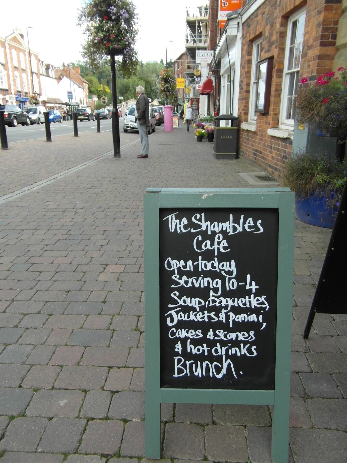
Photographs:


No comments:
Post a Comment