Based on the page layout sketches that were produced, the next stage was to create these digitally, to see how they look with the photographs that will be used for this book.
 |
| This layout is clean and to the point, however with the text below in a bullet point style it looks a bit like a character profile. |
 |
| This use of imagery is interesting and unique, however means you can't really see any of the photographs clearly, everything gets blurred together. |
 |
| This page layout is perhaps more appropriate for a magazine, or a publication which will have considerably more writing than what is planned for this photography book. |
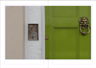 |
| With the photograph taking up pretty much all of the double page spread, the emphasis is clearly on the photograph, however for it to be on this large a scale, with nothing else to distract you, the photograph should be in a very high quality, which I am not sure the photographs for this book are. |
 |
| This is a simple little design, with the photograph taking priority on one side, and text on the other, however as this is supposed to be a photography book, there shouldn't really be too much text, and with a whole page dedicated to text, there may be a little too much space to fill. However the presence of such space being available may let the photograph to really shine. |
 |
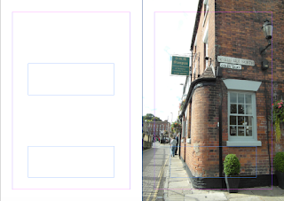
| This page layout leaves one photograph for each page, keeping it concise, however with the photographs only taking up around 1/2 of each page, there is sufficient space for a little or a lot of text, as with the photographs alternating top and bottom end of the page, if there was only a few lines of text, it wouldn't appear like the space hasn't been used, as the photograph that would be in line with it counteracts this. |
 |
| Another adaptation of the above page layout is having the photograph on one side, in this case in the top right corner, and the text on the opposite side of the page, in the bottom left corner, so the two balance each other out. However if there wasn't much text, the photograph may outweigh the text making the spread appear imbalanced. |
 |
| This is another effective page layout, where the photograph is left to take the focus, however with it not filling the whole spread there is room for some text down the side, which makes it almost look like annotations. With the photograph also not being full bleed, this will allow for some room if the photographs aren't that high quality. |
 |
| This is perhaps one of the more interesting page layouts, with space for four photographs across the spread, all of the same, relatively small size, which means there should be no worry about quality of photographs. Because of the photographs being in the middle, this puts all the emphasis on them, perhaps the text could go underneath. With the photographs also very close together across both pages, there could be a bit of confusion as to there being two separate letterforms being discussed, or perhaps it could be interesting to have the same photograph of the letterform repeated across all four photograph spaces, as is shown in this layout example. |
 |
| The photograph here is rather overwhelming, taking up a massive portion of space, it almost looks as if the text is getting pushed off the page. |
 |
| The spacing of text to photograph ratio is much more appropriate, even though only a slight change has been made, or perhaps this is because the text is on the left, so it comes first, and therefore doesn't look like it's being pushed out. |
These digital experimentations have really helped show what kind of page layouts work for these photographs and which just don't. It is important to keep in mind when creating these page layouts, that this book is supposed to be a photography book, so text isn't such a massive aspect, however space should still be made for it, and not look like the text is an afterthought. These page layouts definitely need a lot more development, perhaps after a more solid idea of the concept is developed, and the layouts can be designed for a purpose, rather than to see what works and what doesn't.


No comments:
Post a Comment