This Design Principles brief was all about negative space:
After looking at the examples of ‘negative space’ both in typographic terms and even in photographic terms the workshop is to choose a word i.e. HALT (Typographic) Upper or lower case and see what element you can add to use with or replacing the identified space to create an image suggested by the chosen word/element.
Within the time available, you may render this in any way you choose, if you wish to Mac up, and you feel you have time, go for it otherwise by hand if it suits you as a creative.
What I understand I have to produce for this brief is to choose any word I like, and using the whole word or just a letter from the word, adapt it by adding elements, removing elements or changing the shape slightly to create some sort of other image within the letter or word. This could be an actual image, such as a fish, or it could be so that it looks like it word itself, such as emotional. But before I got started on this brief, we were shown some examples of uses of negative space within photography and in typography, to inspire us with our own designs, and to inform us if we didn't know exactly what negative space involved.
 |
| This FedEx logo uses negative space to show an arrow between the E and the x. This could reflect how fast the service is. You don't notice it straight away, but once you know it's there it is incredibly obvious. |
 |
| This Martini House cleverly uses two martini glasses to make the shape of a house, which reflects the name of the place. |
 |
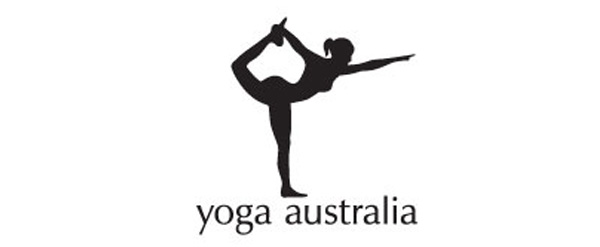
| In this Yoga Australia logo, the shape of the country Australia fits inside the space where the woman's holding her foot. This is very subtle and clever, as you just see the woman to start with, and then you see the map of Australia after. |
 |
| The F1 logo is an excellent example of negative space in a logo, as the 1 is made out of the space of the F, with speed lines on the other side to complete the shape. This incorporates both the name of the sport and an idea of what it represents in the logo. |
 |
| This is another example of interesting use of negative space, with two animals, a giraffe and a rhino cut into the shape of an elephant to complete the elephants shape. This shows the many animals this zoo has, whilst also producing an interesting logo. |
 |
| This use of negative space within a logo is very interesting. Shapes of fruits and vegetables have been cut out of letterforms to make the word itself, which reflect what this company is all about. This is different to a lot of other uses as negative space has been applied in every letterform in this word, rather than just one letterform. |
Negative space in photography is a little harder to define, as it is less objective, as a lot of photography could be considered to use negative space in some way.
 |
| Here negative space is used with the man and woman's faces cutting into the white background. |
 |
| This is another example of negative space in photography, with the person waling and a small strip of land all that invades into the purple sky. |
 |
| Here negative space is used with the hands cutting into the blueish background. |
I find negative space photography really interesting, as the majority of the time it is so simple, and has an interesting kind of humour which is hard to come across in traditional photography.
After being taught about negative space in both photography and logos, we were then set the brief shown above to complete.
I found this brief really hard to undertake, as the whole point of negative space is that it is most effective when it isn't overly thought about. I kept on overthinking my designs, trying to produce anything effective, and this in turn had the opposite effect on my designs, they were very obvious and not very good at all.
 |
| The first word I chose to produce negative space with is milkshake, as I thought I could do something with a blender or a class of milkshake with the letter "H", however this proved more difficult than I originally thought. I then tried the word pencil, and this was slightly easier to produce negative space imagery with, however I still wasn't very happy with it, as they all looked a bit naff. One design I was quite happy with however was using the end of a pencil with a rubber on it in the shape on an "i", which is quite subtle yet effective. I then moved onto thinking about the word glasses, incorporating eyes into the "s"'s and making it look a little like a nose too. |
 |
| This was the final design I presented to the group, merging the "s"'s together and giving them a little swirl to make it look like a nostril. I also added little dots to the "s"'s to look like eyes. This isn't a very good example of negative space, however I felt really challenged by this task, perhaps because I have never had to do anything like this before. |


No comments:
Post a Comment