Following on my initial digitalising of my designs I then started to refine them, choosing my final three ideas that I am going to produce, and also experimenting with different kinds of layout for the smaller aspects I haven't considered yet such as if I'm going to include a tag line or a boarder etc.
 |
| I thought the don't looked a bit weird against the needle, so I tried several different typefaces instead to see if any of them work better. This is my original typeface, and I feel it isn't wide enough, and is too harsh and angular to fit in with the needle. |
 |
| I tried a rounder typeface with a heavier weight to make it span more of the width of the page, however I still think that this is not the right typeface for this as it takes attention away from the needle. |
 |
| This is a similar typeface to the one before, only it has a thin line drawing out the letterforms in the middle of each one, almost as if there isn't a fill on it, only massive outlines. I think that this looks too like a LA bar sign. |
 |
| This is a less opposing typeface, as the weight is a lot thinner, however it still spans the whole width of the paper. I think the kerning is a little to large although because there seems to be a lot of space, this also makes it look kind of Greek as well. |
 |
| In the end I used the same typeface as I had for my "plastic not-so fantastic" poster, and I was very surprised as to how well it had actually turned out. I think that the blood spatters make the needle appear even more menacing, and even thought the word is lower case rather than upper case how I had it previously, I still think that it has a very powerful and forceful effect. |
 |
| I thought that the black background on the previous poster didn't fit in with my other two poster designs, it was really harsh and dark, whereas although the other two were gory, they weren't dark, they used quite light colours. I then tried changing the background of this poster to the same colour as the "plastic not-so fantastic" poster, to try and get them all to work better as a unit. I think this does make all the posters work a lot better as a unit. |
 |
| This was my original design, where I included the tag line "visit saynototheknife.co.uk" in the bottom right hand corner as a website people can go to if they want to find out more information. However I felt like it was a bit too simple and plain, and needed something else to make it a whole design. |
 |
| I decided to change the colour of the link to go to as I thought that black seemed a bit too menacing, especially when the rest of the page used calming colours, nothing that was too garish. I used the same colour as the drops of blood, as I thought the darker shade would work better. |
 |
| I still thought it looked a bit plain to I tried a boarder around the outside, and this added more detail to it and helped to frame the poster and bring everything together, however it still didn't look whole yet. |
 |
| I tried a heavier weight boarder around the page, as I thought this would give it a bit more weight, and I thought the lighter weight couldn't really be seen all that well. I think this works a lot better. |
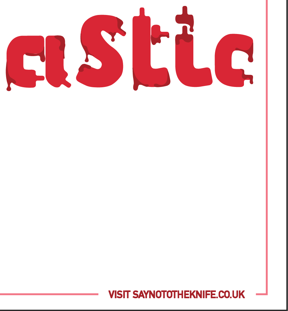 |
| I tried a lighter shade of red, as I thought there needed to be some contrast between the link and the boarder, the same as how there is with the blood drops and the type, and I think this is more effective. |
 |
| I tried a pink background, as I thought it still looked empty, like I had just plonked the boarder down to fill up the page and it hadn't worked. I think this works a lot better with it being a colour, though perhaps the colour is a bit to dark. |
 |
| I then lightened the colour and removed the boarder as I felt that the coloured background removed the need for a boarder. I am really pleased with the outcome of this poster, and feel I have explored several possibilities and came to a strong conclusion. |
 |
| I added the surgery slice marks onto the top of the breasts using the pen tool on Illustrator, as I thought this would make it more obvious that this poster is about plastic surgery. I feel I have made the subtle yet effective, and think they contribute positively to the poster. I also played around with a tag line at the bottom of the poster, just to give a little bit of added information to the poster, to help explain the image more fully. This attempt was in lowercase central to the page, and I don't think it works very well. The lower case means it lacks impact, and it just looks awkward in the centre of the poster. |
 |
| I tried the tag line in uppercase next as I thought this would help to make it more powerful, although still keeping the small size it wouldn't invade on the image as this is an image only poster. |
 |
| I then tried it really big so it spans the whole width of the poster. I think this works really well, however it now takes over the image, and becomes a text and image poster, rather than being just image. |
 |
| I then tried it in upper case small and in the bottom right corner, forming almost a full stop to the poster. I think this works really well, as it is out of the way, yet still there to give you more information. |
 |
| I then thought that because on my other poster designs I have used a website address instead of a tag line, this may be more appropriate to use, and may help to link all the posters together so they are recognised as a unit. I tried it in quite a heavy weighted typeface, however I think it's a bit bold, and makes it a bit illegible. |
 |
| I then tried it lower weighted, and I feel this works a lot better, it has less impact but you can still read it. I think for my final poster I will add slightly more weight to the tag line but not as much as the previous image. |
No comments:
Post a Comment