In preparation for studio brief 4, I was given the task of researching into poster design, how posters initially came about, inspiration for poster design, and key poster designers. I also had to research into how a poster communicates it's message, why it's communicating the message and what the message actually is.
To start off this research I loaded up Pinterest and simply typed "poster design" into the search bar to see what came up. I ended up finding this really useful website which listed some very cool posters (below).
This lead me to an amazing site called Designspiration, which is like a more professional version of Pinterest, and even more artist and design based. I typed "posters" into the search bar and found a whole host of beautiful designs. Below are some of my favourites.
I really like the use of print in "The Daredevil Christopher Wright" by Animal Canon, as it creates a more illustrative appearance, which contrasts very much so with all the other posters above. I like how the blue background also seeps into the red of the little boys cape, it adds to the hand rendered appearance.
The "Star Wars" poster by Olly Moss is also a firm favourite of mine, as I think it's really interesting how all the imagery is inside the silhouette of C3PO, a main character in Star Wars, in a very graphic, simplistic design, but still in keeping with the original Star Wars opening credits, how the "Star Wars" appears to shoot out away from you, just like in the films. The quizzical look on C3PO's face, achieved by the wonky angle of the head and the eye holes being different colours, adds a hint of humour to the viewer, whilst also intriguing them as well.
In the "Mutants are the Enemy" poster for the film X-Men: Days of future past, the Sentinel's robotic fist is punching into the word "mutant", making it get crushed, with bits of the letters flying off up towards the top of the poster. This is a very powerful image, which appears like the Sentinel's are pounding the mutants, which is a direct reflection of what happens in the film, of which I've seen and is very good. The simple colour palette of shades of grey and red, create a gory image, one suggesting danger and death, which could hint at what happens in the film. I thought it really interesting that when I Googled Trask Industries, which is says this poster is brought to us by them, a whole website created by Marvel about Trask Industries, the main corporation in the X-Men film, comes up, and is designed as if it is an actual corporation, one of which you can get a job in (there's a "jobs" page), and is very contemporary, almost futuristic, and is amazing to see that Marvel has created a whole comprehensive website as if Trask Industries was a real corporation. I was amazed to say the least. Although Compare the Market have also done this for their Meerkat advertisements.
POSTER DESIGNERS
Animal Canon
As mentioned above Animal Canon is a lot of things, which I feel is better explained by their "about" section on their website.
They mainly produce posters using screen printing, and very minimal colours, usually just 3 or 4 colours, which creates an illustrative appearance, one that is still very bold with bright colours, but is more vague than typical digital posters produced on Adobe Illustrator for example. Ben-Day dots, made popular by Roy Lichtenstein in the pop art era, are a common feature in their work, which allows for different shades of the same colour, adjusted by the weight of the dots and how many dots there are. Animal Canon's posters all have a similar style, as they are all produced by screen printing, however they all vary drastically at the same time, as you can see below.
These two posters are very, very different, "The Seed" uses very rich, warm colours, and is extremely patchy using Ben-Day dots to create this old-fashioned appearance. However "Wake up sleepy giants" poster looks like it has been produced digitally, or includes some form of photography in it, especially in the milky way imagery. However what is amazing is how they are both produced using the screen print method. "Wake up sleepy giants" is a lot more contemporary, however the T-Rex coming out of the middle of the poster, looks almost like deer heads you would typically find in ranch style houses in America, hinting at a more traditional image.
These are two very different posters by Animal Canon again, however both have been produced using screen printing. I like how both of them are mainly just one colour, but with varying shades of that colour to create the imagery. "Love hurts" uses block colours to create a very punchy, strong image of a roller skating woman punching through a heart, whereas "Here comes the night" uses carefully placed lines and strokes to create the image, which suits the topic, as it makes the image less clear and bold, which reflects how clearly you can see when the sun goes down.
Olly Moss
Olly Moss is a designer based in Winchester in the UK, and mainly creates posters for a variety of films, TV shows and other moving image programmes. He has done work for Star Wars, Spiderman, Dr. Who, and a collection of Asian films.
Olly Moss produced these series of screen printed Star Wars posters for Lucasfilm and Mondo. I really like how the imagery is all inside key characters in the films, and each poster is one main colour with the detail in silhouettes. This creates a very strong, colourful image that is very contemporary. The simplistic images also add to the contemporary appearance. The cream background makes the bold colours stand out even more, and creates a neutral view of the colours, for example if green was against grey, then you would see the green differently than if it was against a white or cream background.
POSTER DESIGN ORIGINS
Posters are one the the first forms of visual communication, and started to be used in the early 19th century as a way of promoting political parties, recruiting soldiers, and advertise products. They were a massive influence on typography because suddenly type had to become readable at a further distance, which required larger type to be produced, often from wood rather than metal. Henry Toulouse-Latrec and Henry van de Velde were two of the initial poster designers of the 19th century.
Lithographs were a common method of producing posters in the 1800's, which is based on using oil and water, producing a reverse negative image of the plate. They weren't used for mass produced work, as they were too expensive to produce. Lithographic prints were produced using grid systems, as the plates had to line up perfectly with one another in order to produce a sleek, clean image.
Jules Cheret's "three stone lithographic process" changed the way posters were designed, as instead of having limited colour, they could now produce any colour they wanted, using only three stones, usually the primary colours, red, yellow and blue, printed carefully. It was a relatively difficult process, however the result produced posters in vibrant colour, with unusual transparencies you can't achieve in any other media even today. This process started in the 1870's in Paris, however due to it's success it quickly spread to the rest of Europe and America.
 |
| This poster for El Dorado music hall by Jules Cheret is an example of the new three stone lithographic process. |
There were many different styles of poster design, which progressed and changed during time. The first style was called Futurist Typographic Design, which was led by Marinetti, the founder of the futurist movement. It attempted to glorify modernity and liberate type from the past and common conventions such as punctuation, adjectives and so on. Instead it focused on sounds and onomatopoeia in type's layout. It had a passion for fighting and speed. The Futurist Typographic Design didn't used grids, they believed that layout and imagery expressed as much as or more than the actual content of the poster.
 |
| This is a letterpress produced by Marinetti, which reflects the Futurist Typographic Design era. |
Dada Design was the next phase in poster design, which despited war and violence, and began during the First World War in Zurich, Switzerland, with the sole purpose being to honour the war. Dada design was often satirical and nonsensical, and created a new art movement itself. One of it's characteristics was to mix typefaces using unusual punctuation. often with horizontal, vertical and diagonal layouts.
 |
| This lithograph was produced by Tristan Tzara in 1921, and was influenced by Dada. It is more structured than Futurist poster designs, however it still has that quirky style to it. |
De Stijl Design came after Dada Design, and was founded in Holland during the First World War, where avant garde art was still "allowed" to be produced, without Hitler getting in the way. This design style consisted of harmonious designs to contrast with the chaos of war. They developed rules and standards regarding type and layout.
 |
| This is a photo-lithograph by Piet Zwart in 1928, an example of the De Stijl design style. |
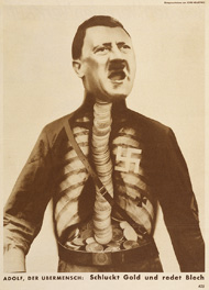 |
| This photomontage poster titled "Adolf Superman" was produced by John Heartfield in 1932 is another example of De Stijl poster design, of which I find quite unusual, as it contains no type, only an image of Hitler with coins for his spine and then more coins resting in his lower belly as well. It creates a strong anti-Nazi political message, in the time of the Nazi's growing in Europe. Heartfiled produced a whole range of anti-Nazi posters, warning against Hitler and the Nazi's, of which you can find here, some of them are very powerful, and the message is vert clear, such as blood and iron, others take a bit more time to understand the message behind them. |
The next poster design style was called America & Federal Art Project, which started during the Great Depression in America. The US government funded the arts to help people who didn't have a job produce amazing artwork, such as posters to promote tourism within America. Jackson Pullock, Jerome Rothstein, Alexander Dux, Frank Nicholson, and Harry Herzog are all examples of artists during this era that produced some really inspirational, and very "good" posters promoting tourism.
The Swiss Design is the next style in producing posters, which is the same style as the Swiss International Typographic Design style, which emerged in the 1940's. It's composition is asymmetrical and uses mainly sans-serif typefaces such as Helvetica and Futura. Grids systems are also used widely during this design style. Black and white photography also replaces all illustrations, in an attempt to highlight modernism.
Post Modernism is the final stage in poster design styles, which encapsulates all the previous styles. It uses colour, and type and crazy shapes and patterns, whilst using sleek lines and occasionally putting text into columns..maybe.
 |
| Jim Fitzpatrick's Guerrillero Heroico poster. |
This research into the history of posters should help me in Studio Brief 4 when I have the task of producing my own poster. Hopefully I will be able to fit it to a style above and use key aspects of it in my own poster, or create my own style combining several elements of the posters above. I have surprisingly found it very interesting researching into posters and different key designers, both from the past and modern. I have found it very interesting and inspiring, so hopefully this brief will be really exciting for me.





No comments:
Post a Comment