Following my final critiques for this brief where it was suggested that I could include a website or charities name to donate money to on my backing paper designs, and my tutor suggested that I should print on recycled paper, I followed on with this feedback and actually made these improvements.
Over the weekend I made a visit to The Corn Exchange in Leeds, and went to a little art shop in there called Medium, and bought a sheet of handmade, recycled paper that was quite thick and had lots of little hairs in it, and had a nice, rough texture to it.
 |
| New paper. |
I then modified my designs on the computer to include the donation aspect and got rid of the tacky frame I had previously placed my design within. I used the website name "savetheforest.org" as I thought the charity was going to be an organisation website, one that was global not just national, and the name "savetheforest" was just a version of the backing paper design title "save our forests", so that if people read the title but not the donation website, they can easily find it based on the title.
I then printed these designs off on my handmade recycled in the digital print studio, so that my prints looked professional.
 |
| Grass lungs final design printed on handmade recycled paper. |
 |
| Broccoli lungs final design printed on handmade recycled paper. |
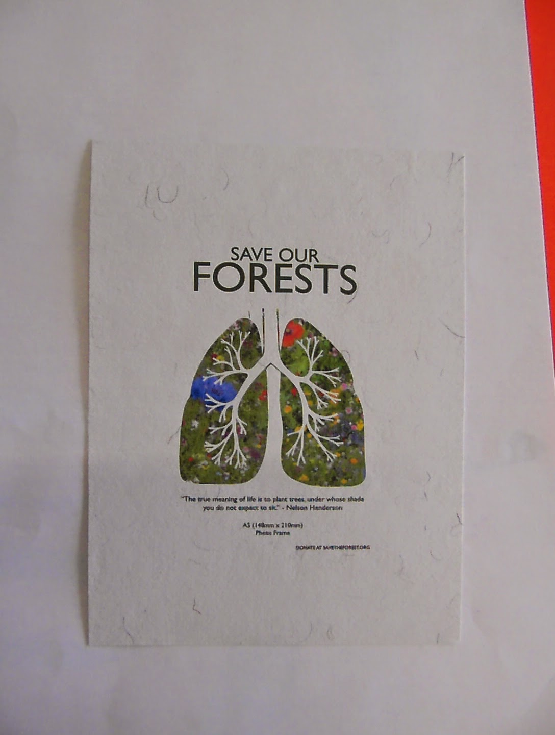 |
| Flower lungs printed on the handmade recycled paper. |
I then researched all different kinds of reclaimed and recycled, natural looking frames on the internet, and chose one to use for all of my backing paper designs.
 |
| This frame is actually a chalkboard, and is rather similar in style to the Mulbury Slim Oiled frame below. I like how simple and flat the colouring is, how you can't see the notched or grain of the wood really. This makes it look not quite as reclaimed, even though it is. |
 |
| I really like the duo colours used on this frame, as the white is very simple and neutral, and contrasts well with the pistachio green inner frame, which in turn highlights the photograph inside the frame. I like how the paint isn't perfect, but is worn and chipped all over, giving in a pre-loved effect. |
 |
| This frame is very similar to the frame above, only the colours have been reversed, and instead of green there is a beautiful blue instead. This looks to be not a photo frame but a frame for a mirror as well, but I don't think this matters that much, as the frame itself is still the same. Again, which I'm finding in many of the reclaimed frames I have found, the paint is chipped and worn off, and I think this is a really effective affect on these frames to distinguish them from ordinary frames. |
 |
| This frame has the same inner and outer frame effect as the previous few fames, and also has the same chipped paint effect, only the paint is much less chipped in this frame, and also looks more glossy. This perhaps suggests this is a newer frame, or one that has been looked after better or loved more. I like this style however the white and cream colour scheme make it look like your wedding photograph should go in it. |
 |
| This frame is similar to the one above only is has 3 levels to the frame, and is varying shades or white and grey instead of cream, which makes it look less wedding-y, which is good. The inner two frames also have unusual textured effects, the middle one looks quite sandy, and inside one looks like cracked porcelain, which is really interesting. I don't however think that a white frame will suit my designs however with most of the design being white anyway. |
 |
| I really like the colour of this frame, as it's pastel pink but looks kind of yellow-y and almost pearl like. I do think it looks a bit feminine however, which won't fit my unisex target market. |
 |
| This frame is quite interesting, with a really dark wooden frame that has been painted white and is cracked a lot and the majority of the paint has came off as well. I like the frame a lot however I feel the frame is a bit too chunky for the size of the photograph in it, and I think the photograph will get swamped by the size of the frame. |
When researching these reclaimed photo frames I found a great brand called Mulbury, who make a wide variety of photo frames, both in normal sizes and also specific sizes on request, using reclaimed/recycled Australian timber.
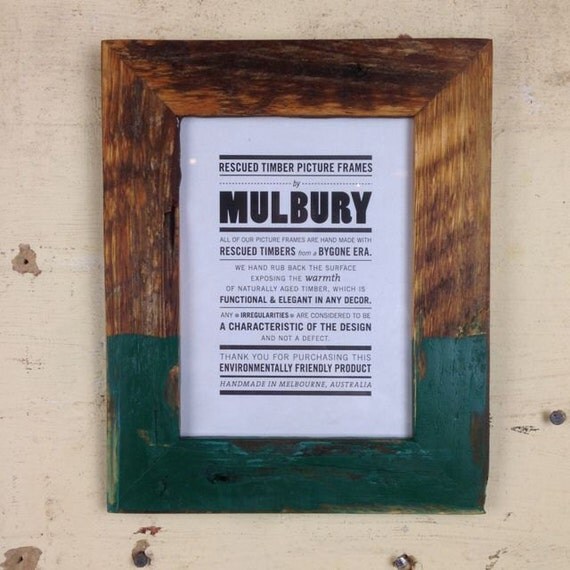 |
| I think this frame is really beautiful. I love how most of it is natural wood, but the bottom half appears to of been dipped into paint. The paint however looks worn and isn't even at all, and this makes it look even more worn and rugged, yet adds a bit of colour into the frame. |
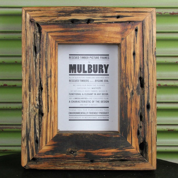 |
| I also really like this frame by Mulbury, as I like how you can see the grain in the wood on the frame, and all the little holes in the wood add to the reclaimed effect. The colour is also not that dark, but is a rich, honey-like colour. |
 |
| This is another one of my favourites by Mulbury, as the frame is a lot thinner than most reclaimed wooden frames, and this makes it look unusually delicate, and allows the frame to still be very evidently there, but the picture in the frame stands out a lot more. This particular frame is 7 X 5 inches and slim oiled. |
After researching all of these reclaimed frames I then chose my favourite one, that I felt would fit best with my designs, which is the Mulbury Slim Oiled frame, and cropped out the background and the current backing paper to leave room for my own designs.
 |
| First I removed the background of the frame on Photoshop by selecting the outline of the frame and then reversing the selection so the background is selected, then deleting it. I had to reshape the frame slightly to make the corners of the frame exactly 90 degrees, and to do this I held the CMD button and dragged each corner into place, then selected the excess background and deleted it, so only the frame itself was left. |
 |
| I then placed guides along the inside edge of the frame to ensure everything was straight, and I then selected the backing paper and then deleted it, so that only the frame itself was left. |
 |
| I then copied the frame onto new documents sizes A3 and A4 and coped the frame into it, resizing it so that it is the right size for each different size of backing paper. For my A5 design I had to create an A4 document and copy the frame into it, but make the frame A5 size because the smallest size I can print in the digital print studio is A4. |
I then cropped my photographs of my final designs printed onto the handmade recycled paper and inserted them into the frame relevant to it's size.
 |
| Broccoli lungs with the background removed. |
 |
| Grass lungs with the background removed. |
 |
| Grass lungs with the background removed. |
I then placed these new prints of the frame designs into the cropped Mulbury frame, placing the print on the layer below the frame, so that there is a very clean, precise edge to the inside of the frame.
 |
| This is the grass lungs design printed on the handmade recycled paper in the Mulbury frame. I think this works really well against the frame, and the bright green of the lungs stands out against the darker wood of the frame. |
 |
| Broccoli lungs in the Mulbury frame. I think the design really compliments the frame very well. The handmade recycled paper my design is printed on also has a much better effect of looking used and worn. |
 |
| Flower lungs in the Mulbury frame. This new, less contemporary frame compliments the natural style of the print, and the handmade paper as well. The colourful petals add a hint of brightness to the whole design, catching the eye. |


No comments:
Post a Comment