Before I started doing my research I created fact file cards at A5 size to present my research in. I thought it best to produce the structure of my cards before I started my research so that I knew how much space I had to work with.
 |
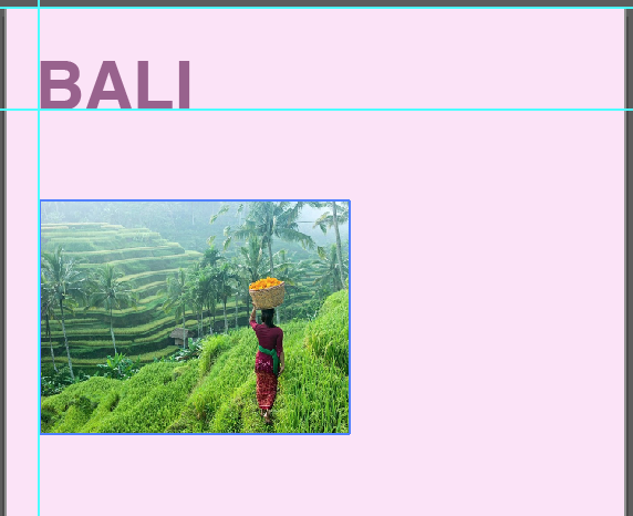
| This is my basic design layout for my fact file cards, with the space at the bottom left for the research to go. I chose a purple colour theme as this is the colour that first came to mind when I thought of city fact file cards. I thought it felt warm and would compliment any photograph I chose to place in it. I used guides to ensure the heading, photograph and text all had the correct spacing, and this spacing continued throughout the rest of my cards. I chose the typeface Helvetica Bold for my heading, as it is neutral yet bold and simple, I feel it has a strong impact immediately. I chose to align my heading to the left hand side of the page because the eye naturally reads left to right and I thought this would help the aesthetic appeal of my cards, making them easier and more pleasant to read at a glance. |
 |
| I then thought about what typeface I was going to use, and different boldness for the subtitles. I chose the typeface Avenir Next in Medium at 11pt for my main body text, as I thought it was simple and modern yet not boring somehow. I adjusted the kerning and spacing to make the letters slightly further apart from one another but the lines closer together to give it a more compact yet spaced out look. I experimented with different weights for the subtitles. I started out with Demi Bold, which I think is too closer to Medium, the boldness of the main body text. I then tried Bold, which is far too bold it looks blocky and chunky. I then went back to Demi Bold, but increased the stroke weight to 0.2pt, which makes it slightly more bold, but not overpowering. |
 |
| I then came to decided where I should actually position the image within the card, as for the landscape images they work better being central to the page, however this doesn't work very well for the portrait images. I tried it with a portrait image and also aligning the heading centrally, to try and make it look more even, and it does, but I still think it looks forced and unnatural. I then settled on having the portrait images aligned to the left as I had started off with originally, as this is the best layout for them I feel. |
 |
| I then tried having moving the landscape images to be aligned on the left to try and get a uniformed appearance, and I think this layout does actually work quite well. It looks quite effective, and it doesn't appear forced. |
I then compared the landscape images centrally aligned to being left aligned, to see which worked best amongst the other portrait images as a set. It was quite hard to decide between the two, but I went with the left aligned landscape images in the end, as I feel it creates a more uniform appearance, rather than some being some way and others being a different way, which looks more uneven. I don't think the appearance of the landscape image cards have been hindered by me choosing them to be left aligned, as I feel they work just as effective on their own to be left aligned, as they are centrally.


 |
| I then experimented with exactly how aligned left the images were. Initially I had left a little gap between the aligned guide and the image, so that it was slightly indented, however in my experiments with the landscape images I placed it directly on the guide. I thought to compare the two to see which I thought worked most effectively, and I feel that the image aligned right on the guide works the best, as it creates a clean, sleek line down the left hand side, rather than it being a bit wiggly and vague. |
 |
| These are my final fact file card designs for my destinations. I am really pleased with their overall appearance, as they look very uniform and well structured, and the images are take up a suitably proportionate part of the cards, so that the text stands out in it's own right but the images are still bold and clear. |
No comments:
Post a Comment