Having already produced fact file cards for Studio Brief 2, I already have a good idea of the kind of style and design I want to produce my publication for this brief in, so I thought the best way to start off this brief was to look at some of my own publications, and the layouts that they have used, which I could interpret for my own publication.
I started off with the Baa Baa "Drinks Manual" for Hallowe'en, which I had picked up from the bar last Hallowe'en.
 |
| The front cover is very minimal with only three colours in it's colour scheme. The illustration is simple and almost diagrammatic, which is in fitting with the content of the leaflet, as all the drinks are based on the theme of "science" and "the big bang". The title is in the top left hand corner, so it acts as more of a heading rather than a title, the illustration takes centre stage. This design is very simple, which I want my publication to be of a similar style to this one. |
 |
| This leaflet contains an introductory double page spread, saying what the theme of the drinks is all about, which I think is quite interesting, and provides a good starting point for the rest of the menu, however in a bar I doubt many people would read this, I certainly didn't. The balance between illustration and text is effective, as although there is one whole page full of text, it is of quite a large type size so doesn't look so daunting, and the illustrations on the opposite page help break it up as well. This is something I could include in my publication, summarising my brief and the research I have done to fulfil it. |
 |
| This is a starting double page spread for a certain variety of drinks Baa Baa sells, and they have included one introductory page describing their revolutionary varieties of cocktails, portraying theirs as better than anybody else's. This is similar to the introductory page from above, and perhaps something I could include after my destination cards, before I get to my survey analysis, to help separate my research into sections. |
 |
| In this layout there is simply one drink of each page, with the image taking up the majority of the page, as after all, it's the look of the drink that matters. There is space for information about the drink at the bottom, with subheadings in an orange shade, to highlight that they are actually headings. The name of the drink is at the top of the page, in the left hand corner, similar to the name of the "Drinks Manual" on the front cover. It is visible and there, but is perhaps not the first thing you look at. Something I find interesting on this page is how the chemical formula for each drink is shown directly below the name of the drink, making it look even more sciency. |
 |
| For these drinks they have fitted three on a page, two on the left and one in the middle on the right hand side of the page. I feel this doesn't look that organised, and it is a little confusing to know what text goes to which drink, especially if a little or a lot drunk too. I don't think I will be using this layout for my publication, as I don't feel it is as coherent as I would like it to be. |
 |
| This is a much more structured layout to the one above, and it is very clear what text goes with which drink. I think this is effective for this drinks menu, as these shots are small so you can fit a lot on a page without it looking overcrowded, however I don't think this would work for my destinations publication, as I would have to really reduce the amount of information I include on each place in order for it all fit in, and the publication would also be very few pages, with such a lot of information on so few pages. |
These are page layouts from a magazine I picked up from "Village Bookstore" called Little White Lies, and has loads of reviews and information about movies and actors, alongside some seriously funky illustrations.
 |
| This is a really quirky contents page, where the title of the articles are on the horizontal part of the stairs, and the page number and description of the article are on the vertical part below the title. I think this is really interesting and unique, especially with the bold colours making it very vibrant and in your face. The unique thing about this contents page is how the contents text is organised, as otherwise this would just be an interesting illustration. However I don't think I could do anything really like this for my publication, as unless I used stairs it wouldn't really have the same effect. |
 |
| This page has been separated into sections, almost so it looks mathematical, with only two colours used on the page. Perhaps I could separate my information about each destination in a grid like system for my publication, to organise it better, and to show each section clearer. |
 |
| I think this is a really interesting layout, as both sides of the page have been split in half only in different directions, yet at first glance they look exactly the same. I like how the illustrations are at opposite corners of the page, as it breaks up the text, so it doesn't look so daunting. I also think the column system works well, in that it helps distinguish what text goes with which illustration, at least in the left pages case, the right page is a little more tricky, the only clue is the heading of the text. |
 |
| This is part of the film review section of the magazine, which I feel is a lot more simple and back to basics with it's appearance. It is very clear which review goes with which photograph, due to the separating lines down the centre of each page. There is however a lot of text on this double page spread and it looks like a lot of text as well, although if I use this layout for my publication then my photographs are often a lot larger than these, so will take up more space, so the text won't look so expansive. |
 |
| This is another example of layout from this magazine, which again each page is split into two sections, only this time vertically. It reminds me of a similar layout to the Radio Times, where for each channel there is a key programme on that day at the top with it's photograph, and then all the other programmes on below it in text, and there was always a coloured banner across the top of the page showing the date. This is extraordinarily similar to this layout, and it works in communicating it's message and being very clear, however the text shouts at you in the face unpleasantly. I also like how this double page has a pink background, and the next page similar to this was on a yellow background. I think this almost shocks you when you open the page, and makes you read it more carefully because of the coloured background. I do although think it brightens up an otherwise slightly simple page. |
 |
| This is the last page in this magazine, which acts as a kind of conclusion to the magazine is a clipboard-y kind of way. I like the simple black and white notebook style article, stamped onto a background dull of green and pink faces, with arrows joining specific people together. This could be an interesting way to summarise my own publication, as kind of a conclusion to the whole thing. |
 |
| Next I found this "Hello Fresh" leaflet which uses bubbles to convey the information. The bubbles are small and compact, with only enough space for a short sentence in each, accompanied by a photograph. I thought this idea could work effectively as a "fun facts" page in my publication, something I have concluded from undertaking my research about a specific destination. It could be a fun and different way to present interesting or unexpected pieces of information. |
I then found this double page spread in the newspaper "Thought Bubble" from a comics and game design convention at Leeds College of Art last term.
 |
| This is actually a double page spread of adverts, however I like how the pages have been split into four distinctive blocks, with a clear boarder around them, so they look kind of like photo's in a photo album. I could perhaps do the same with each destination, creating slots for each place to fit into a decorative design with a simple boarder around it. |
 |
| This page layout is from a newspaper called "The Skinny". I found how the different bands have been given numbers, as this helps to organise them. I also like the combination of photographs and columns, it helps this page look more manageable, especially with snippets from the article in larger writing, to attract the readers attention. However I still think this layout doesn't hide how much text there is, however it does try and break it up a little with the techniques listed previously, although I don't think this layout would work for my publication. |
I scoured the pages of Elle magazine next, to find interesting page layouts.
 |
| This was one of my favourite designs, with the spiral strong and central to the page, adding an element of pattern to the magazine, however at the same time informing us about certain aspects. This spiral design I found was used several times within the same issue. This could work as a cool introductory page, saying all the things this publication aims to showcase, yet adding pattern to the page as well, I didn't have to produce it in a circular spiral either, I could try a square or rectangular spiral to better fit to the shape of the page, or even make a shape out of it, although this may prove tricky. |
 |
| This is an interesting page layout, one that could easily be adapted and changed to fit the content. I like how there is a map of the place these women were photographed in, as it gives some geographical context to the article. I also think how each woman has their own individual box to fit in works well in separating them out, and these photographic boxes could easily be partially replaces with text, and wouldn't loose it's design aesthetic. I think this could work really well for my publication, I could even use different sized boxes and match them all up like a wall full of photo frames. |
 |
| I found interesting how numbers have been incorporated into this page layout, fitting amongst the images and text, adding pattern to the page. Perhaps I could use this idea as part of my introductory page, only with words rather than numbers, to show facts yet also to fill space and include some sort of pattern. However I don't want it to look over complicated and busy. |
This book titled "Sprinkles!" is one of my favourite books I got for Christmas this year, and is all about making food colourful, and the pages themselves are a true reflection of this.
 |
| This is one of the first pages of the cook book, and is an eye catching one at that. The double page is one beautiful, colourful photograph with a simple title on one side, showing that the book is all about aesthetics. This could be an eye catching and bold first page for my publication. |
 |
| Here the product being the cakes have been used to fill the rest of the page, when there isn't enough text to fill it. This works really well as a footer, whilst also adding imagery and vibrant colours to the page. Perhaps I could think about photograph footers or boarders for my publication. |
 |
| This is another kind of footer the cook book uses a lot, which I think is really pretty, the colourful sprinkles lining the bottom of the page, making the text look less dull. Footers are evidently a very important aspect of designing books, they complete a book and sometimes if done correctly and interestingly give it something extra. |
 |
| This is one style of header this cook book often uses. It is delicate and simple, but makes this design look more feminine, and starts the page off on a clear and friendly note. |
 |
| This page layout is from a book called "100 ideas that changed fashion", and I like the way the text is on one side of the page, with photographs framing it on the other side, almost appearing to give it something to lean against. The picture on the left hand side detracts from the text however, swamping the right hand page, however it does illustrate the point of the text. |
I then moved onto researching publications and page layouts from Pinterest, to discover layouts that are a bit more unusual and so that I could hone down my research to a style that I think may suit my publication and it's content best.
 |
| This page layout about Wayfinding and Interaction Design is really interesting how different pieces of information and photographs are separated into different sized boxes and all slotted together to make an interesting pattern. There is a continuous colour scheme throughout all of the photographs as well, so the page works together as a unit of articles and photographs, rather than individual aspects. |
 |
| This is a double page spread layout from Tapestry Magazine, designed by Morpheus. I love the geometrical style of the spread, how the triangular photographs interlock creating a pattern out of photographs. I feel this could work really well as a centre page for my publication, showcasing all of the photographs from my destinations, especially those that didn't fit on the destination research pages. I feel it would create a tactical break in my research. |
 |
| This passport case is really interesting, with the pattern looking a little like really expensive, handmade wallpaper. The main thing I like about this passport cover is the simplicity of the design, with a simple image covering all of the cover, with only a simple white square holding the small amount of text. The white square helps to break up the imagery, and stands out very effectively, so would be ideal for a heading or the title of my book. |
 |
| This is a double page spread from the tour guide La Loupe, designed by design studio GREAT. It is so much more than a tour guide, it has a whole extensive visual identity. I chose this double page spread in particular over all their other extraordinary shows of imagery because I specifically like the intersecting, geometrical styles photographs, how you can get several different views of the same place or activity in a much smaller area than if you had the full photographs on show. |
 |
| Next Triangle Step travel guide covers by Sonia Castillo. Similar to La Loupe, I love the geometrical design of these covers, with the different shapes intersecting and overlapping, with varying transparencies, creating new colours within these overlaps. I also like the simple colour schemes, especially using pastel colours creates a creative and comforting vibe. |
 |
| This is a Retro mini magazine, from which I find the shapes that have been used as a background pattern add something extra to the spread, replacing the need for a pattern. This is also another take on the geometrical style I am going towards for my publication. |
 |
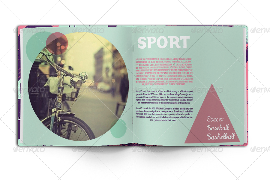
| Dwell - Coastal cities revisited travel guide by Sidney Lim YX, has a very alternative front cover, where acetate has been used to print the title of the publication on, so that you can see the photograph on the next page through it, but the title has a dreamy, cloud like appearance. This also allows the photograph to be printed undisturbed by the title, so you can appreciate it fully. This is something I feel could work really well with my publication, as I want it to be very photographical, it would be a shame to cover photographs in text when there was no need. |
 |
| This travel guide is another really interesting example of how imagery can be used untraditionally, with the photograph stretching along the top width of the spread, but being cut off at al angle, so that the text can be seen clearly without the photograph getting in the way. This is a more subtle geometrical design, but with the same basic principle of cutting off images at angles. |
 |
| This is another double page spread from the same travel guide and the layout above. Here I like how the title of the destination has been split in two, with the first letter a large point size on the left, with the rest of the name of the place continuing on the other page along with all of the information. This allows the one letter to stand out really strongly on the one page, contributing to the pattern and photograph on that page. The photograph on that page as well is rather unusual as it is green duotone, but has been intersected with a purple section in the bottom left corner, to highlight the word in that corner, and to add a bit of something quirky to the page. |
All of this page layout research has been of great use to me, as it has shown me many different ways of producing a page, different styles and techniques, and how the more simple designs can sometimes be effective. One thing I have learnt from this research is that I shouldn't include too much text in one bulk as this swamps the reader, making them not want to read it unless they were really interested in the topic, whilst at the same time making the page look a bit rubbish.
No comments:
Post a Comment