The board itself.
 |
| I started off creating a basic shape for my board game, so that I could get an idea of the dimensions I was going to have to be working within. I chose red and green as random initial colours for the tiles simply so that I had two contrasting colours that allowed me to see when one tile finished and the next started. |
 |
| This is the colour scheme I have chosen for my board game. I chose primary colours and then a green, as this seemed to be the most popular choice for colour schemes within a lot of existing games, which I found out from my research. I didn't wan to use overly garish and bright shades though, as I didn't want my board to be so overwhelmed with colours, I wanted the colours to be prominent and bright, but a slightly more subtle shade of these colours. I thought that this slightly less vibrant colour scheme would also make it more appealing to adults as well, as they might see it as something that was more grown up and challenging for them, rather than a silly children's game that has no real point to it.I also chose primary colours and green because I wanted to create a unisex colour scheme, so that this game appeals to both men and women. |
 |
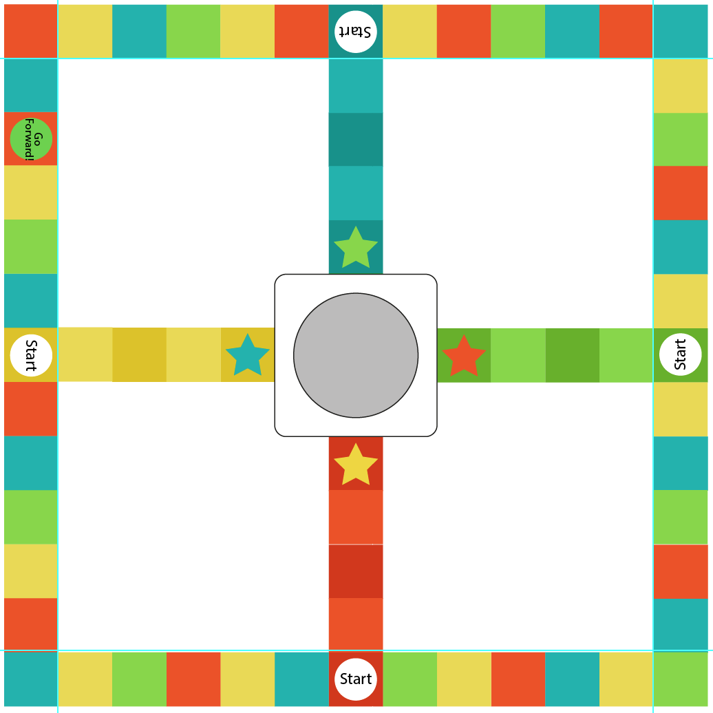
| I thought that the squares were a lot too big for the previous board design, so here I have made then quite a bit smaller. I also did this to increase the amount of tiles leading up to the final star, so the players have to travel further to get to the final. In doing this though I had to increase the size of the board by a certain amount so that I ended up with a middle tile, rather than the middle of one edge being inbetween two tiles. I also started applying my colour scheme as well. Here I have only applied it to the paths leading up to the centre, but on these I have used two different shades of each colour, so that the central paths can be all one colour, highlighting which path each specific player must travel up in order to reach their final point. For example the player with the red playing piece must travel up the red path. I chose to use stars as the finishing point, as I thought that stars would represent success in a simple way, without having to actually write FINISH on each of the final squares. I think this works really nicely, an understated finish line. Initially I had the stars the same colour as the path that lead up to them, but then I realised you couldn't really make out the star too clearly because of the similarities in colour. Instead I changed the colour of the star to the colour of the path to the left, so the red path has a yellow star on it, and the green path has a red star on it. This definitely makes the stars stand out a lot more, but still keeping with the colour scheme. |
 |
| Using the colour scheme I have established previously, I created these circular instructions to place onto specific tiles, so that if payers land on them then they must do what the tile is telling them to. Because I wanted more than 4 instructions for the game, I had to choose another two colours for my circles, so that each different instruction had a different colour, making it easier to distinguish which circle means what. I chose a purple and a pink for the extra two colours, as I thought these were different colours to my colour scheme, yet were of the same shade and warmth, so they blend into the other colours quite nicely. I don't think that the choice of pink and purple colour tiles will make this board game look girly, as these are only very small circles, and there a whole lot of other colours on the board that are neutral or even masculine. For the "Q" and "Start" tiles I chose to use white circle tiles as I wanted these instructions to stand out the most, as these are two of the most important parts of the board. I thought that the white will stand out strongly amidst all of the colour within the rest of the board. |
 |
| I started placing some of the tiles onto the board, just to see how they look against the other tiles, and I think they fit it well with the overall aesthetic of the board. I also changed the rest of the tiles on the board to the colour scheme, not making them in any particular pattern, as I wanted my board to look a little spontaneous and random, rather than ridiculously ordered.I think the use of the colours I have chosen definitely make this a unisex game, as there is nothing striking about it that suggests it may be better suited to boys of girls. |
 |
| I placed in the rest of the circular instruction tiles around the rest of my board, trying to place them evenly, so that no matter what starting point you start on, everyone has an even chance of winning. One problem with using the same colour circles as tile squares was that I couldn't place a yellow circle on a yellow square for example as I wouldn't be able to make out the circle, so I had to make sure that I placed the circles on tiles that were not the same colour as them. Here I also filled in the centre quadrants in the same colours from the colour scheme, with the colour quadrant the same colour as the path to the left of it. I used the same colour as from my main colour scheme, not an adjusted shade. This looks really effective, however the quadrant now merges into the central paths being the same colour, which I don't want, as I want the whole board path to stand out more so than the quadrants. |
 |
| I thought the quadrants looked a little distant from their path being on the right hand side of the colour path, so I changed them round to the left of the path instead, and I think this works a lot better, and definitely helps to link the path to the quadrant, even though they are the same colour. |
 |
| To make the paths stand out more against the quadrants, I changed the opacity of the quadrants, so they are all still the same colour, only a lighter shade of it. This makes the path look a lot more important than the quadrant, and the quadrant now works as a background rather than an active part of the path. |
 |
| I thought that seeing as though this is only a 4 player game, and there's 10 map pieces to collect, there were rather a lot of question tiles, which I thought might make this game a little too easy and quick to finish. To to resolve this I removed some of the question tiles, to make the game harder and last longer. |
 |
| The next step was to make the pieces of the map that players would have to collect as they travel around the board answering questions. To make these map pieces I found an extremely simple world map off the Internet that sectioned off the individual continents. |
 |
| I uploaded the photograph of the map to Illustrator and went around it using the pen tool creating my own images of the earth. I filled in the different continents using a similar colour to the original colours of the map. |
 |
| I didn't think the original colours would fit in with my board game colour scheme. Instead I filled the map using the same colours fro my colour scheme, adding in a few extra as there is more map pieces than there are colours in my colour scheme. I think this looks a lot better, and the colours are much more complimentary. |
 |
| I inserted the map into my board game, rotating it in each quadrant so that they are each facing the same direction as the time on the same coloured centre path. I think that the colours in the map make the board look way too complicated and overcrowded. There is too much going on and too much colour it is becoming confusing. |
 |
| I changed the map to white instead to make the board look less complicated and overcrowded. I also had to remove the outline on the map pieces and move them slightly further away from one another, as now they are all the same colour there needs to be a sizeable gap between each piece, so you clearly know where one stops and the other starts. This looks a lot more calm now the map is white. The map being white will also make the players think more carefully about where to place the map within the quadrant, as they won't have the colours to match up, they will have to look at the shape of the map. The map slots on the board will be made out of plastic, if I was able to get this board produced professionally, in the same principle as the holes for the playing pieces around the board in Frustration. The map pieces will simply fit into the gaps, like a puzzle. |
 |
| I thought about different typeface I could use for the name of my board game. I experimented with Myrian pro, Gill Sans at varying stroke weights, Avenir Next, Oriya Sangam MN, and Sathu. The typeface I prefer is Gills Sans (2 and 3), because of the roundness of the letterforms, and the loop on the "g", making the title look welcoming and friendly, yet not too stripped back and simple. The heavier weighted title works better I feel as the whole point of a title is for it to stand out and be extremely bold on the page, something which I don't think the lighter weight achieves. |
 |
| I also tried the title with a mixture of upper case letters, to give it more power. I think the all uppercase title is the most effective, as the uppercase letterforms make it look stronger and more regular. |
 |
| I then applied the title to the board, placing it above the map, and rotating with the board , so that from every angle you have can read the name of the board game. |
 |
| I created a pair of dice to go inside the dice clicker, to illustrate more clearly what the random circle thing in my middle actually does. |
 |
| I then placed the dice on the board to show where they would go. This is my final board for my board game. I am very pleased with the outcome of this board, as it doesn't look overcomplicated or crammed full of different elements. I feel there is sufficient space around all the elements of the board, so it doesn't look overcrowded. I also don't think that the board looks as though it is aimed at a specific gender or age range, as the colours are neutral and bright, but not dazzlingly so, and the design is simple, but not in a dumbed down kind of way, the information and design is just minimal, with no unnecessary elements. |
 |
| I started out having blank cards in portrait orientation, however I think the card looks too cramped full of information, with no enough words spanning across the card, making it hard to read. |
 |
| I tried this same layout in landscape orientation, and I think this works a lot better as the information has a lot more space around it. I do think though that the Q and A letters need to be more distinguished, so that they stand out more. |
 |
| I tried the portrait orientation again, only using a inserting a margin down the left hand side for just the Q and A to go down separating it off from the rest of the information, making them stand out more. I think this works better as a layout, however the information text still looks cramped. |
 |
| I tried the same margin layout in landscape form, and I am really pleased with this outcome. The Q and A stand out as being headings, and the text has sufficient space to breath as well. |
 |
| I started designing the front of the cards, which on many playing cards is actually quite intricate and detailed, however I wanted to go for a more simple approach. I used the same tiled border for the card as I used for the board itself, to frame the title better. I think this frame works really effectively, however in portrait orientation the title looks really small and insignificant. |
 |
| I tried this in landscape orientation, only with the title the same point size, and the title definitely needs to be a lot larger to stand out and fit comfortably within the card. |
 |
| Here I made the title a lot larger so that it fits comfortably within the card, and it definitely has a lot more punch to it now, and is a lot more powerful. |
 |
| I thought about using a longer title "Question Cards", but I think that this is just unnecessary, and when I asked my peers what they thought they also said there was no need for it, as you know it's a card just by looking at it. |
 |
| I decided I wanted to put some sort of imagery on the front of my cards, similar to in the SNAP crocodile cards from my research, just to make it a little more eye catching. However this map is a bit too bright so that it makes the title not as easy to read. I want to include imagery, however I didn't want it to take over from the title. |
 |
| I used the same map but changed the opacity down so that it wasn't as bright, and this helped you to be able to read the title easier. I also made the stroke weight of the title heavier to make it bolder and stand out more. |
 |
| I then tried a yellow background to this card, but I think this just makes it look childish and unnecessary. |
 |
| I then thought about applying the same tiled border to the question side of the card, however I think the tiles are a little too large and they swamp the text, not giving it any breathing space at all. |
 |
| I then tried a smaller tiled outline around the question side, and this definitely gives the text more space, although I think that the plain design works better, as it is simple and lets the text take centre stage, and there are no distractions from the text. |
 |
| I thought about trying a more photographic front side of the card, more similar to the style of Studio Brief 3, however you can't read the title at all because the photographs are too bold. |
 |
| I tried putting a white border around the edge to make help frame the photographs, and I think that this is unnecessary. |
 |
| I changed the opacity down on the photograph to make the title stand out a lot more, and it definitely does now, although the photographs now look faded and don't have the same impact as the full colour ones do. |
 |
| I then tried it with the white border around the edge to give it more impact, although I don't think it does, it just makes it look even whiter. I don't think I will pursue with the photographic style, as it doesn't fit in with the rest of my board game imagery. |
 |
| These are my final question cards, where I used a more colourful front of the card to catch people's eyes. The question side of the cards I kept very simple, as similar to the Cards Against Humanity cards, I want the content to be the main focus, not the design. |
When it came to printing off all of my question cards, I had a little problem fitting all 70 of my initial questions onto paper so that I made the most use of the paper. I could only fit 66 onto 3 A3 sheets of card, and I thought there was no point in printing off the other 4 cards, as I thought this would be a waste of paper, and the extra cards weren't really that important or necessary.
 |
| I printed out my question cards, all 66 of them, and separated them into two piles, one pile for the questions, and the other for the other side of the cards. In hind sight, I probably shouldn't of printed off all 66 of the cards, as it wasn't necessary I should just of printed off a selection to show what they would look like. |
 |
| I produced 10 of the cards fully cutting them out so that they had the rounded edges, and the question was on one side and the title of the other. I stuck the two sides together using double sided sellotape, which actually when although they would of looked more professional if they were printed double sided, the two sheets of stock stuck together gave added weight to my cards, making them more sturdy. |
The playing pieces.
 |
| I took a photograph of the Earth from space I found on the Internet and traced around the continents on Illustrator using the pen tool, to create a more stylised map of the Earth. |
 |
| I put these continent outlines onto a circle and then created a base for the earth as well, so that it can stand upright without rolling all around the board. I initially had the continents as the four colours from my colour scheme, and I tried to make the sea a similar colour to what the sea actually is in the Earth photograph. Although this looks very accurate in colour, I don't think the dark colour of the sea looks very appealing against the bright colours of the continents. |
 |
| I tried using the same colour of blue only a lighter shade, and this shade really doesn't work well with the colour of the continents, especially the red, as the shades are much too similar. The blue is much too bright, where I want the continents to stand out, not the sea, as the continents are the colours that the players need to recognise, so they know what Start tile to start on. |
 |
| I made the sea a lighter shade of the colour scheme colours for each playing piece, so that the colour of the playing pieces is very clear. I think the continents stand out well against the sea as well, and I don't think that it matters that the sea isn't an accurate colour, as the continents aren't either, and it just adds to the colourfulness of the game. |
 |
| I tried a lighter, less bright shade of blue, as in my original ideas I imagined the Earth playing pieces as having a blue sea, and this shade of blue compliments the colours of the continents really well, except for the blue, which merges into the sea rather startlingly well, although this is not what I want at all. I don't think that blue is the way forward, as although the idea is a good one, in practice it has proved hard to find a shade of blue that compliments all of the continents colours, yet also lets the continents stand out. |
 |
| I thought about trying a grey shade for the sea, and this makes the continents and their colours stand out really well, although it just makes the look a little bit dull. They don't have the shine they should have. I am going to use the Earth playing pieces where the sea is a lighter shade of the continent for my final designs, as this colour combination is the most colourful and fulfils my aims. |
 |
| This is my final rule manual design. I didn't really do any development on this, as from my research I had a pretty good idea of exactly what I wanted my rule manual to look like. I applied the same basic structure of the columns, to try and break up my text a little bit. I am still aware there is a lot of text in this one sheet, but a rule manual has to explain how to play the game, this is just the nature of what they are. I used a border around the page as well, the same as I did for my question cards, to help it to fit in with the rest of my board game. |
 |
| I printed my rule manual off on cartridge paper I bought from the library, as it is slightly off white and a interesting texture, and a slightly heavy weight as well, but not as heavy as card. When I first printed it off though I mustn't of made sure the file fitted onto the paper, so part of the border got cropped off. |
 |
| This is my final rule manual, printed on cartridge paper. This time I made sure I printed it off correctly, so that all of the file fitted onto the stock. |
No comments:
Post a Comment