St Vincent's singer is called Annie Clark, who also features prominently in the majority of the music video's for the tracks. The album she has most recently created, titled "Birth in Reverse", she described as being
"a party record you could play at a funeral."
"
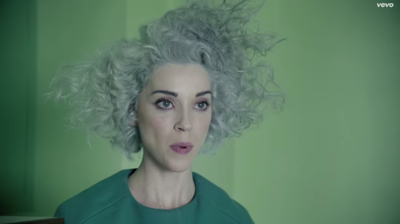
Digital Witness, another new album cut, speaks for the small human being in a world of billions, all of us in a constant discourse with the identity-free ones and zeroes of technology." -
The Guardian
I went on to have a look at St. Vincent's website and at the cover's for her albums as we, to see the style she liked herself and her band to come across in.
St. Vincent's website:
 |
| The colours on the website reflect the simplistic style of the Digital Witness music video, using similar colours as well. The dotted background provides a footer the the initial first look you get at the website, and suggests there may be more to follow if you scroll down. The whole appearance is very simple and neutral, but the shade of purple for the main background does make this website appear quite feminine, especially when coupled with the dotted pattern. |
 |
| When you scroll further down the website, the dotted footer turns into the background for an image with St. Vincent and the bands logo. Annie Clark is wearing clothes that match very effectively the website, that they are a similar shade and colour of the background, and her dress is sparkly, which is similar to the dotted background which could be perceived as being sparkly. The logo also matches the purple colour scheme, but isn't bold enough to take the focus away from the photograph of St. Vincent. Although pattern and logo and photographs are involved in this website, it still manages to remain incredibly functional and simple, with a lot of space around everything, adding to the simplicity of the design. |
St. Vincent on Galway International Arts Festival website:
 |
| This summer St. Vincent is on tour for her new album Strange Mercy, and is performing at Galway International Arts Festival. This is a clip of their website where you can buy tickets to see her performing. This website is less simplistic that St. Vincent's own website, purely because it has to contain a lot more information, but it still manages to maintain the simplistic style with the header showing St. Vincent herself, reflecting her personal style. |
St. Vincent's album covers:
 |
| This is actually a 12" record cover for St. Vincent, containing a Digital Witness DARKSIDE Remix. This cover features the same colour scheme from her website, creating a continuous style throughout all of her products, website and music videos. The cover has been split in half, with what you would imagine be above the top half, actually at the bottom of the cover, creating a broken up appearance, splitting of characters or opinions maybe. The whole cover has also been given a bit of a pink wash over it, which is especially evident in Clark's hair at the bottom of the cover, in comparison to it at the top of the cover. The top half also seems to be split off again, only with it rearranged just slightly more to the left than it should be. This gives the cover an offbeat kind of look, or perhaps as if the record is juttering and skipping over unreadable parts of the record.The photograph has been taken from the Digital Witness music video, which I think is an effective reference to the track, yet also a way of linking the aesthetic style of the music video to the style of everything to do with St. Vincent, merging the two together to create a stronger connection. The text on the cover is very small and simple, to let the imagery stand out, which I think works really well, as the cover is comprised of several different elements and sections, which all slot nicely together, and if you were to whack text on top of that, it would spoil the cohesion between every aspect of the cover. The text is however in uppercase lettering to ensure it is noticed and does have some impact, but this also gives it a very square appearance so that it works as more of a strip of colour across the two main halves of the cover, rather than as being informative. The sans serif typeface also adds to the simplistic style of St. Vincent. |
 |
| This is the cover for St. Vincent's album "Paris is Burning". This style is quite in contrast to any of St. Vincent's other merchandise and album covers, as it is uses black which is quite a striking colour, one which doesn't fit the style of anything else to do with St. Vincent. This cover is however very bold, geometric and simplistic, which is in fitting with St. Vincent's general style. I don't like this cover personally. I feel the black is too domineering, and the chosen typeface is clumpy, especially with the lowercase "st." at the start, the roundness of the "s" and "t" contrasts far too much with the "V" for it to work together, especially when there is nothing surrounding them to detract attention or to make them work together. |
 |
| This is the CD cover for St. Vincent's latest album "Strange Mercy", which is the album Digital Witness features on. This is in a much similar style to the record cover above, using the same thin, sans serif font for all of the text on the cover, and also using very simplistic colours, with a basic, uncomplicated design. I like how you can't tell what the photograph that covers the cover is of, it adds to the mystery of it, especially when coupled with the title of the album "Strange mercy" which is an unusual title bringing up a whole load of questions about what it actually means. |
 |
| This is St. Vincent's self titled album, which features the same imagery from her website. This is a very bold image, with Clark looking like a Queen on her throne, only in a much more simplistic and modern world. The same St. Vincent logo has been applied, which I think adds to the appearance of the cover, making her look more royal. The vibrant purple and blue of her dress also add to this suggestion, as these are typical colours royalty wear, as it expresses wealth. The colour of the chair however is completely contrary to this, in a light pink shade that is better suited for a rubber duck that a throne, however this highlights the contrast between the two styles, and makes us recognise how far we have come in the modern world. The dotted background creates an interesting backdrop to this whole scene, and also allows the simplicity of the chair to stand out, as the dots are complex and contrast with it. |
After this research into St. Vincent's general appearance on the web and on her album covers, I decided to capture some of the most powerful clips from the Digital Witness music video to help me with compiling my initial designs for the record sleeve. I also looked at a few other music video's to see how the style or tone of them compared to that of Digital Witness, to see if Digital Witness was different to the norm, or the norm itself.
Digital Witness music video stills:
 |
| The contrast between the marching people and the yellow of the building is interesting. Also the colours of the building, the green people and the sky create for an interesting colour scheme. The marching people remind me of the Oompaa Loompaa's of Charlie and the Chocolate Factory, all marching about their business in an orderly fashion. |
 |
| This is the room which St. Vincent sings a lot of the song in. The contrast between the yellow of the room and the green of her dress creates a striking image. I also think it adds to the obscurity of this image how there is a blind on one of the walls, which is closed and looks as if there isn't even a window behind it, just the allusion of one being there. |
 |
| The rounded roof of the building to the right breaks up the very geometrical imagery in the video. The pillars supporting the roof also could lead to interesting imagery in my designs. The lampposts are very sci-fi as well, with round bobbles for the lights, which may or may not be lights as you never see them lit up in the video. This whole scene looks very much as if she's on an abandoned modernist factory park that's in the middle of the desert and is very stark, as you can't see anything for miles past these two buildings. |
 |
| These two girls look like evil genius', and shows how communist this idea is, as they're wearing the same uniform and their hair is done in exactly the same way, all in matching colours as well. |
 |
| I find this image interesting as it shows the people actually working, although again everything is colour coordinated, with the people wearing yellow suits and rolling yellow giant cotton wheels. The yellow is contrasted against the grey of the building and the blue sky. |
 |
| This is a very grey scene, as all of the buildings are made out of raw concrete in this shot, although there does appear to be some sort of road system, which is obviously being ignore as the people are standing in the middle of it. Because this scene is so grey, the vibrant blue sky stands out as being brighter than it probably is, and also the yellow people and St. Vincent herself stand out in their colourful clothing as well. The different coloured clothing possibly suggests signs of ranking within this strange world. |
 |
| This scene is really interesting to me as it highlights the geometrical qualities of the rooms themselves, as the blue is separated from the grey walls using a white banner, moving round the ledges at perfect angles. What I also find unique in this shot is that there seems to be some sort of ornament in the room, which is unseen of in any other room, everything is usually very functional. However here there isa geometrical shaped stone that is of a similar blue to the girls uniform. This makes me wonder it's significance and why it is in the shot at all as it doesn't have to be there at all. |
 |
| I really like how warm the concrete appears on the buildings where the sunlight is shining, especially when you can see the ordinary concrete bathed in shadow right next to it. The whole skyline is a similar shade of bluey-grey as the sun goes down. The yellow people almost blend into the background as the light goes down making them seem duller. |
 |
| This purple shade is fascinating, as it puts everything into a darker light, making their lives seem dull and actually quite dark. St. Vincent also blends into the background here as her dress becomes a similar shade to the sky in the darkness. The buildings to the left also strangely look like shipping containers due to their being angular and rigid looking and varying shades of similar colours. |
 |
| This is one of the only times you see the green people up close and interacting with one another, which actually makes them look like normal people, although they look like they're praying before dinner yet also in some sort of business meeting as well. Again all of the objects and people in this image are different shades of green, which suggests that this is definitely being done on purpose, and when something does contrast with this idea, why? |
Here you can see St. Vincent in several different coloured backgrounds, which possibly may suggest she is the leader of this world and is over seeing everything. It also portrays her in different lights, and the different backgrounds change her face in different ways. For example in the dark purple background she looks a lot older and sadder, however in the darker green background she almost blends into the background, looking at home.
 |
| This is the ending scene to the music video, which suggests she wants to see outside her window, outside her wall, perhaps prison as she is in a different coloured room to her dress, however she doesn't know how, hasn't been taught how perhaps? It also looks a little sad as she can't actually see outside, because there probably isn't any window there for her to see out of. |
The Digital Witness music video to me is really inspiring as it has a distinctive style to it which I feel is key I try and portray in my record sleeve designs.
St. Vincent - Cheerleader
This music video is very morbid and depressing, with a giant woman captured and almost on display in an art gallery for people to observe and look at. It ends with her breaking apart like a porcelain doll and crashing to the floor. The colours are all very dull and dark, which reflects the tone of the track itself. The only aspect of colour in the music video is the woman's lips which are a vibrant shade of pink, which happens to be a common thing for St. Vincent's music videos and the starring woman.
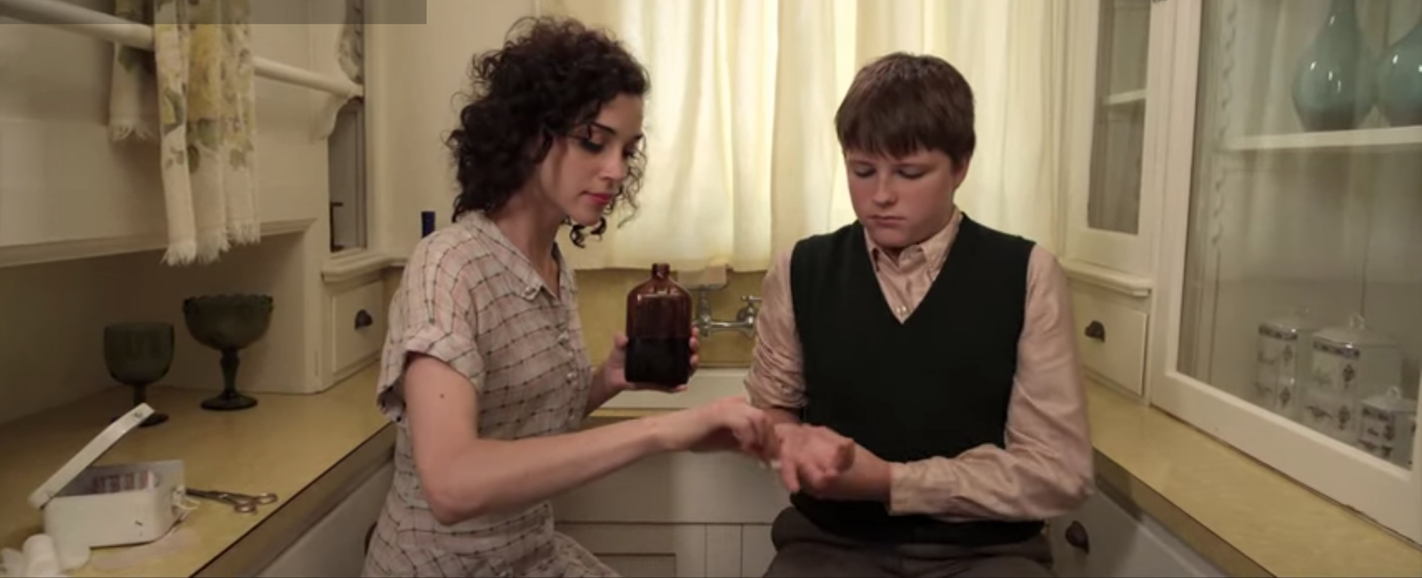
St. Vincent - Cruel
This is again a very morbid song where the children and father try and kill their mother several times, and in the end end up burying her alive, where the mother doesn't even struggle with them. The track itself has a very upbeat rhythm to it, when the video is very sad and depressing. This still however doesn't appear to be set in modern times, but perhaps in the 80's or some time period similar, as the clothing they are wearing is very simple and modest, not at all reflective of modern times.
 |
| Mundane, ordinary setting in a supermarket. Makes her seem so normal. |
 |
| You can see her trying to be a normal mum and wife, however fear and worry is stricken all over her face. |
 |
| As a gun is put to her head, she doesn't look sad at all, only accepting, as if she knows it is for the best. |
 |
| Here you can see the brutality of the woman's children, and the little girl tries to drown her mum, her mum not trying to stop her. |
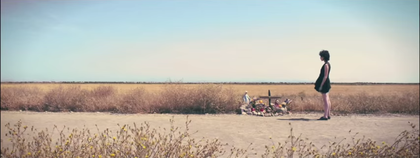
St. Vincent - Marrow
This music video isn't sad I wouldn't sad, but is just a girl lost in the world and it shows people stopping and following her to help, as she asks for help walking along to nobody in particular. In the end however it reverts back to the starting image, as if it was all a dream. The track also starts off quiet and smooth, then suddenly bursts out in loud, beating music, then reverts to the quiet at the end as well, as if it has come full circle, like the video suggests. The loud music and asking for help could perhaps be what the girl is dealing with in her head, and this could be a look into her mind. This video looks more so like it is set in modern times due to the clothing choices, however the main woman, which all her video's I have seen have featured one key woman, is wearing the same bright coloured lipstick that features in all of these videos.
 |
| This is the starting and ending scene. |
 |
| Here you can see the dark side to the video. |
 |
| She stands off to the people who are trying to help her, who are following her at least. Makes you question whether or not she actually wants their help. |
This research into some other of St. Vincent's music videos has been really useful to me, as it has shown me a common factor; the red lipstick, and the woman. It has also shown me that in each of her video's there is some struggle to do with the woman, and the woman is always the main character in each video. Although most have a strong, perceptively cheerful beat, the women are all sad in some way, unsure of themselves, and living a life they don't want. The videos show how each woman reacts to her own situation, which I think is quite interesting, as I chose these videos as random, and for them to all connect and have many things in common is really interesting. What I also found out though was that none of the videos have the same style as the Digital Witness video does, but range through different eras and styles, which perhaps shows that the style of the Digital Witness video may be key to that specific track, but not to St. Vincent as a brand, the woman and her issues is more what defines St. Vincent, not her style. I feel I should reflect this somehow in my designs, showing that the woman wants to experience more and live a fuller, different life, but is just stuck.


No comments:
Post a Comment