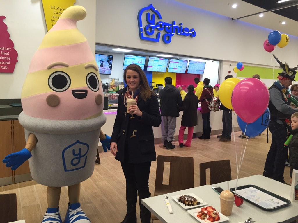
The Hungry Sandwich Club, a design studio based in Leeds, came in to talk to us about how they set up their own design studio during their last year studying Graphic Design as Leeds College of Art, which was only last year, and how they have evolved as a studio and as creative practitioners, and some of the projects they've been involved with. It was fascinating to know they designed the Yoghies frozen yoghurt sign in Leeds The Core, which I walk past frequently. They had also worked on a whole range of other projects but this was the one that stood out the most to me as it was something I walk past regularly and recognise.
 |
| Yoghies Leeds The Core new mascot and signage designed by The Hungry Sandwich Club. |
We then got set a live brief, which we had to complete in the same groups as for Studio Brief 3, which was to design the map for the North Leeds Cycle Trail for
Leeds Indie Food Festival. We could produce it in any style we wanted, but we had to include each of the 5 stop off points within the map, and a description of each place, as well as a brief description about the cycle trail, which was all shown on the brief. They would choose one map design from the selection we produce as a year, and the winner would be used in the programme for the Leeds Indie Food Festival
 |
| The Brief. |
 |
We started off by producing a mind map of all our ideas. We thought about having illustrations of buildings along the route, either of the places themselves or key land marks surrounding them, to help people navigate easier where they actually are. We then thought about producing the titles hand rendered, as this might make it look a little different, although we thought the text itself should be digitally typed, in a sans serif, so that it is easy for people to read still. We considered the colour options, and agreed that we should use mainly pastels, however thought that maybe neutral colours and then one bright colour might help to highlight certain elements. We then considered the illustrations themselves, whether they should have black outlines, no outlines, or a slightly darker than their actual colour outlines, and which would look best, although I think we would only know this through experimentation. Finally, we considered the path itself, and decided it should be made up of patterns, adding to the illustrative style. We considered the different type of patterns we could use as well.
I then started doodling out what I thought when I thought of the cycle map, incorporating the hand rendered, uppercase place names, and the patterns joining these together. I also incorporated start and finish lines, as I thought this would reflect the fact that there's a specific start and finish, and that it's a cycle trail as well. My other group members experimented with different patterns alongside my patterns, just to see which worked best. |
We then drew out the different elements of the map we knew we wanted to include that would be hand rendered.
 |
| Potential "&" signs for one of the place names. Also start and finish signs as well. |
 |
| Place names and title of the map, also more possible "&" signs for one of the place names, more in fitting with the rest of the typography. |
 |
| Start and finish words for the banners, done by the same person as the place names, to achieve consistency. |
 |
| Shapes to join up the places and to make up the actual map. |
 |
| Numbers, to number the places, so you know which one goes first and which one you finish with. |
I then took all of these and uploaded them onto Photoshop, removing the white paper background, and changing the levels so the black was a lot more black, rather than just being grey. I then uploaded them to Illustrator and image traced them, and then expanded them so that I could move things around more easily.
 |
| Initial map design. I used a screenshot of Google Maps to make sure that all the places were in the right place, to help the cyclists be able to use this map easier, rather than it just being purely an illustration. |
We then thought that there needed something to fill in the space, so a member of the group set about drawing the actual buildings of the places themselves, to use as even better reference points for each stage.
 |
| Finished drawn houses. |
The same as for the place names and the patterns, I uploaded individual photographs of each house onto Photoshop, changing the levels to make the black lines more black and the white paper background a lot whiter, making it easier to remove the background, leaving just the black outlines. I then uploaded each individual house onto Illustrator and image traced it and then expanded it as well.
It was also suggested by The Hungry Sandwich Club that we should try using hand rendered type for the descriptions of the places as well as for the map itself, so the same person who drew the place names also wrote out the descriptions as well. We decided to write out the place names for the descriptions as well, using a thinner fine liner to do so, so that it didn't just look like we'd copied and pasted the name place names form the map itself. All the descriptions we copied from the brief, we didn't have to make them up ourselves.
 |
| Haley & Clifford. |
 |
| Opposite - Chapel Allerton. |
 |
| The Hungry Bear. |
 |
| Alfred. |
 |
| Whites Deli. |
 |
| Brief description to start off the map. |
We then placed these into the map design we had previously created.
 |
| Initial map, with the descriptions placed in. Everything aligned left to create order, and to make it easter to read. Made "our suburbs" uppercase in initial description to highlight the start of the map, so it doesn't just look like random text. We removed the numbers to go on the map itself as we thought this was an unnecessary extra, and that they looked out of place, not fitting in well with the map. Instead we placed the names of the places in the path of the map itself, to make it easier to know which places comes next, especially with The Hungry Bear and Alfred as these two places are literally next door. |
 |
| Using the Google Maps image, another member of the group went round a lot of the grass areas on Illustrator using the pen tool, to add a bit of colour into the map, acting almost as a pattern. We also went round some of the rivers as well, adding an extra subtle colour into the design as well. This is our final map design. |
We had to submit our final map design to The Hungry Sandwich Club by 6pm that day, making sure we saved it as a PDF file and in CMYK colour, and 300dpi format, so that it will print effectively.
A few days later one of our group members, who submitted the file, got an email from The Hungry Sandwich Club saying that our group had won the live brief and our design will be printed in the programme for Leeds Indie Food Festival, with us credited for the design as well, which is safe to safe we were all rather chuffed about.


No comments:
Post a Comment