Following on from my initial experiments, I tried two colour map designs, to see which colour combinations work the best together, still trying to keep the colours unisex though as best as possible.
Initially I tried yellow and pink, only because this is the colour combination which I think will look the best together from the one colour experiments I did. This colour combination is extremely feminine however, so I probably won't be using it for my final map, I just wanted to see what it would look like so I have a bench mark to reach for my other colours.
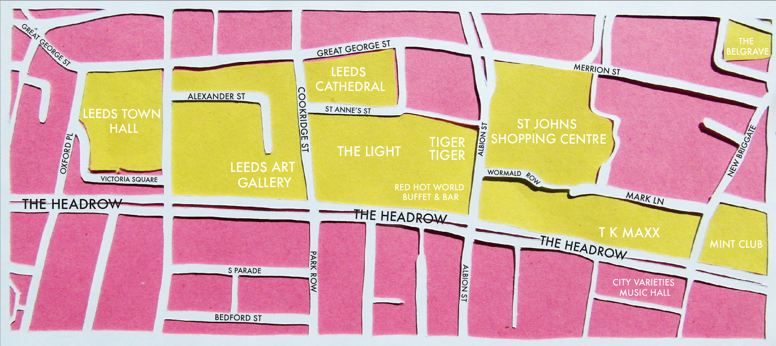 |
| I really like this pink and yellow combination, the two compliment one another so nicely, creating a very sunny, cheerful map. |
 |
| I tried replacing the place names with numbers, as I think this is how I am going to have it on my final map, with a key to list the places, so the map is as least crowded as possible, making it easier to read and less confusing. I think the numbers looks a little like they are floating though, they need something to hold them in place. |
 |
| I tried putting the numbers in circles, centrally aligning them so the number with right in the middle of the circle. I think this works really well, the numbers definitely hold their own a lot better, although perhaps the circles should be of a heavier weight, as at the moment they look a little flimsy and fine. I feel like they need strength to hold the numbers in place by being a heavier weight, but not quite as much as the numbers themselves so that they don't over power the numbers. |
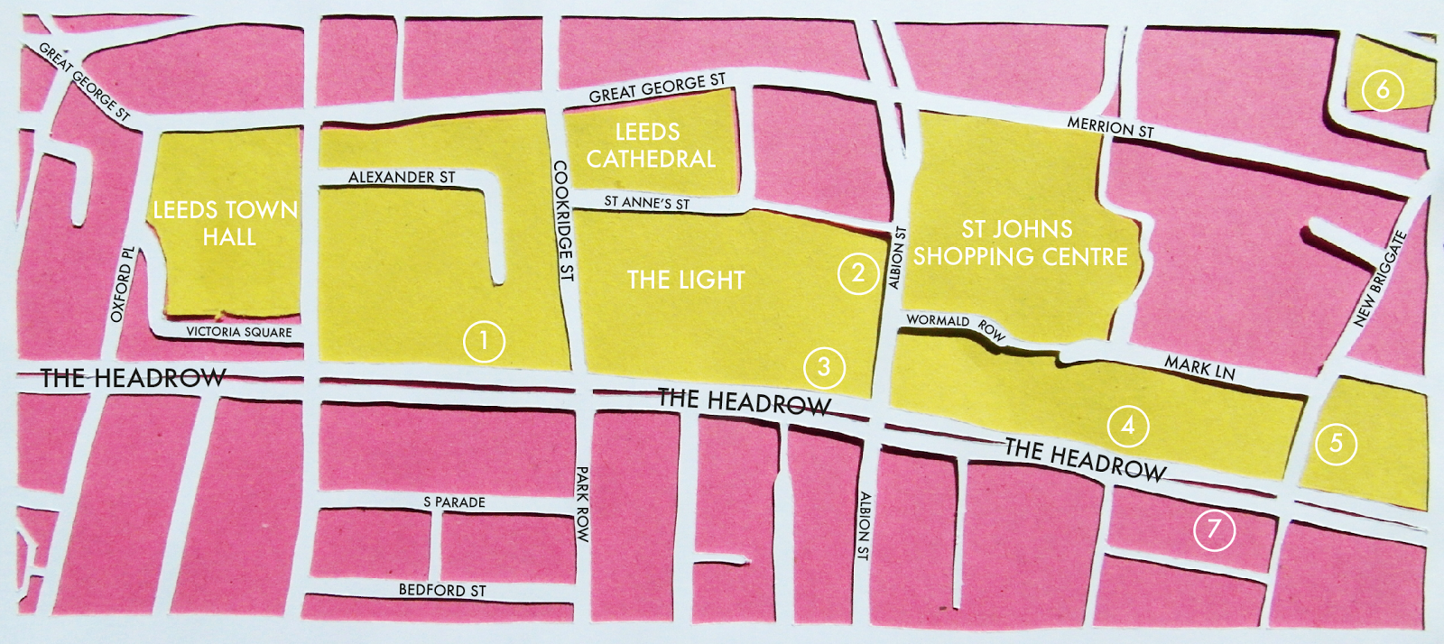 |
| I increased the weight of the circles more to make them look more substantial, and this works a lot better, the circles hold the numbers in place nicely. I think this is the guide I will use to produce my final map in. |
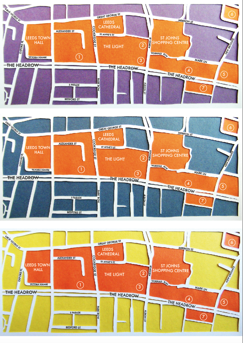 |
| I think the purple and orange combination works really well, as they are contrasting colours, and the orange helps to make the purple not as feminine. I don't think the blue and orange works as well though, as the blue doesn't look as vibrant as the other colours, I think because it has more of a grey element to it. The yellow and orange colour combination works really well, as the colours are very neutral but extremely sunny looking. There is also a really good contrast between the two colours, as the orange is a lot darker than the yellow so stands out on the page a lot more boldly. |
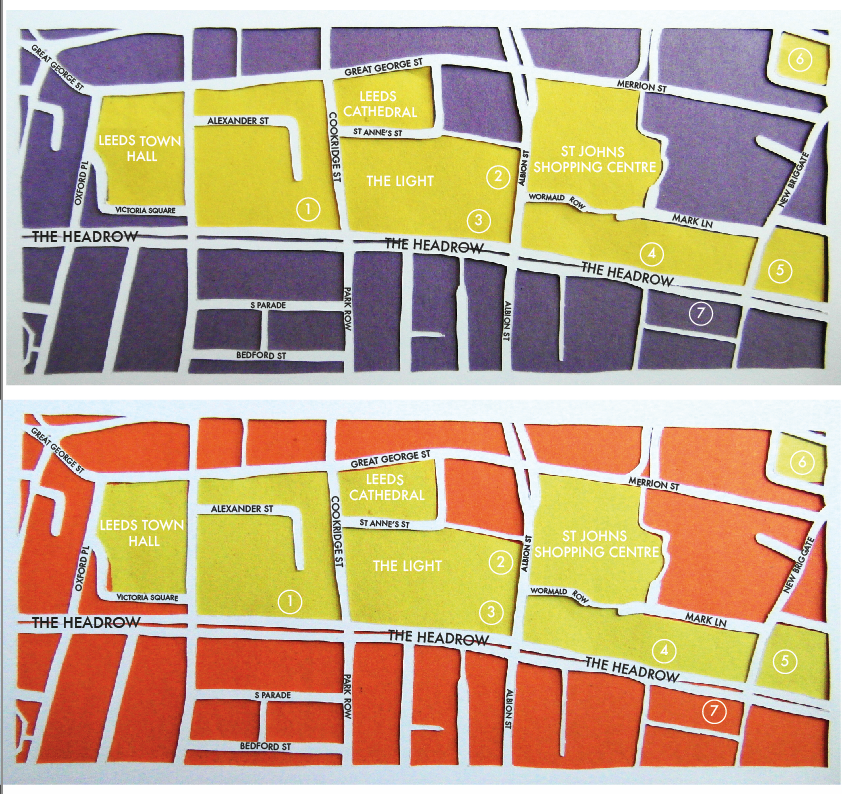 |
| I tried purple and yellow, and this works really well too, there being a great contrast in shades and tones too. The yellow also helps the purple not too appear to feminine, by making it look darker than it is and therefore less feminine. I think the orange and yellow design, with the orange as the background colour this time, also works well, although I think the reverse of this design previously works better as the key places stand out more being in the darker shade. |
 |
| I tried green and orange as I thought these were two pretty neutral colours, and both had came out nicely in the single colour experiments, however I still think the green looks like it's showing grass areas, especially as it's the background colour. I then tried orange and pink, however this looks extremely feminine, and I don't think there is enough difference in shade for the two colours for it to be bold enough. I then experimented with 4 different colours, as this is how many colours I will be using on my actual map. I also could also use the green for the green areas. I think that perhaps the colours are too feminine, which I think is the use of purple as the background colour, maybe yellow would work better? The colours are also all quite warm, I feel like I need more contrasting colours. |
I decided to stop experimenting with colour combinations, as the stock I was using was only in A4 size, and I would need A2 for my map, so I realised I may not be able to get exactly the same colours, so should wait to see what colours are available before I do any more experimentation.
Actual size of map:
I wanted my map to be square so that it would fit nicely onto a regularly proportioned piece of paper, but have two strips down either side that I could use for keys for the map. I also wanted more detail in the map than I could get from the scaled out Google Maps image, so instead I zoomed in on Google Maps to show the detail I wanted, then screen shotted lots of different sections of Leeds, then put them all together like a puzzle, lining them all up, to make one larger map with all the detail. This was actually a lot easier than I thought it would be, and it was relatively easy to align everything as well thankfully.
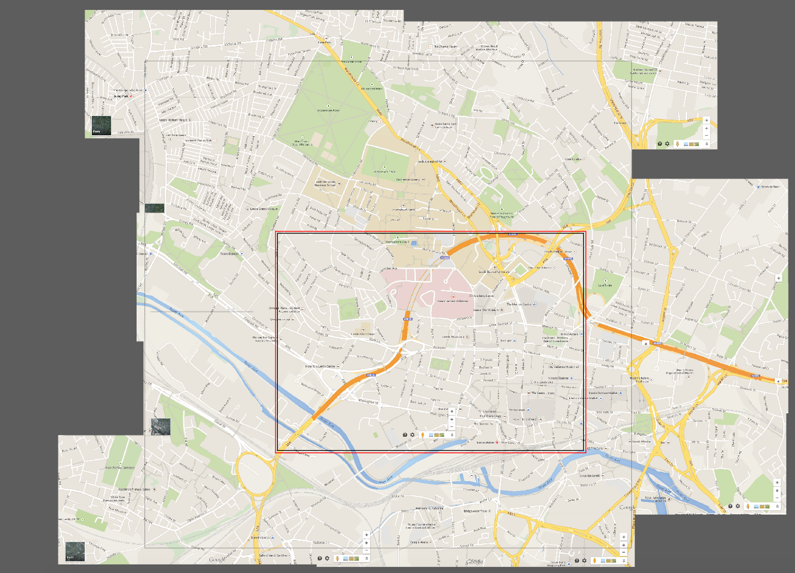 |
| Screenshots of Leeds put together to form one giant map. You can slightly see the square outline which will be the size of my map. Everything inside the square will be included in my map. |
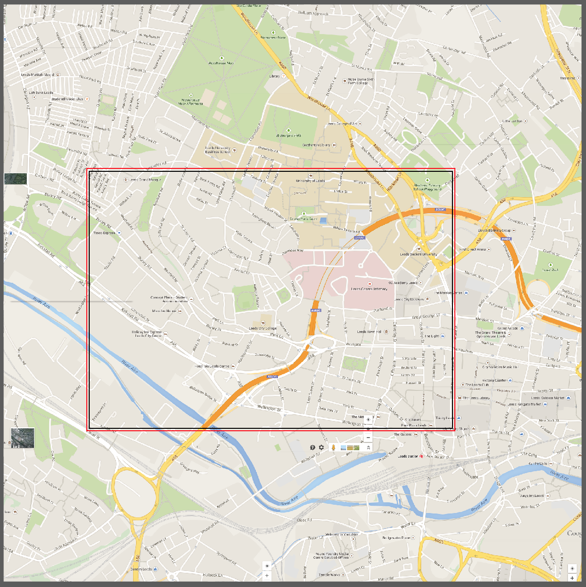 |
| I created a clipping mask of the map, so that everything outside the map got hidden, so I could see exactly what was and wasn't being included in the map. |
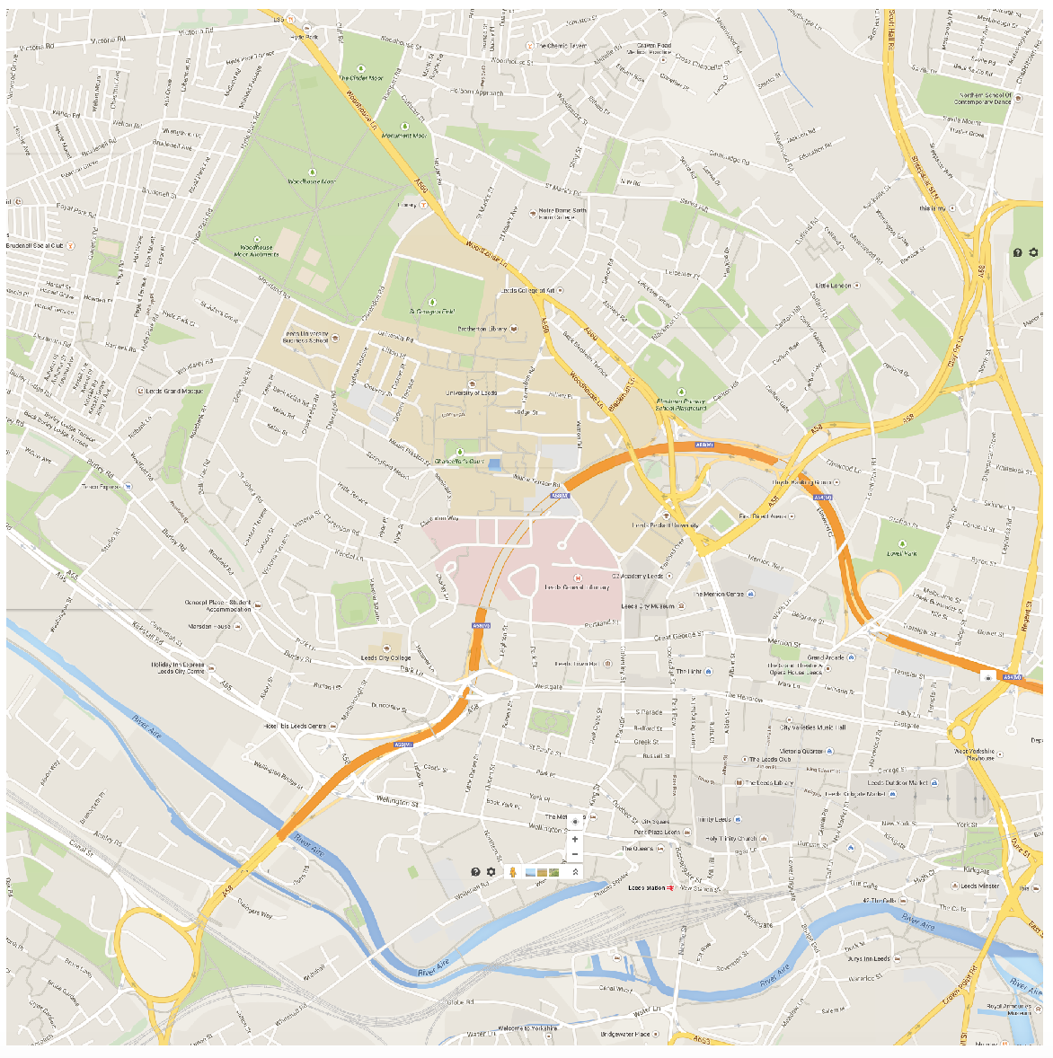 |
| I repositioned the map slightly so that it covered the right side of Leeds more and less on the left side, mainly to include Colours May Vary, as I thought this was a really important place for a graphic designer. |
Plotting places:
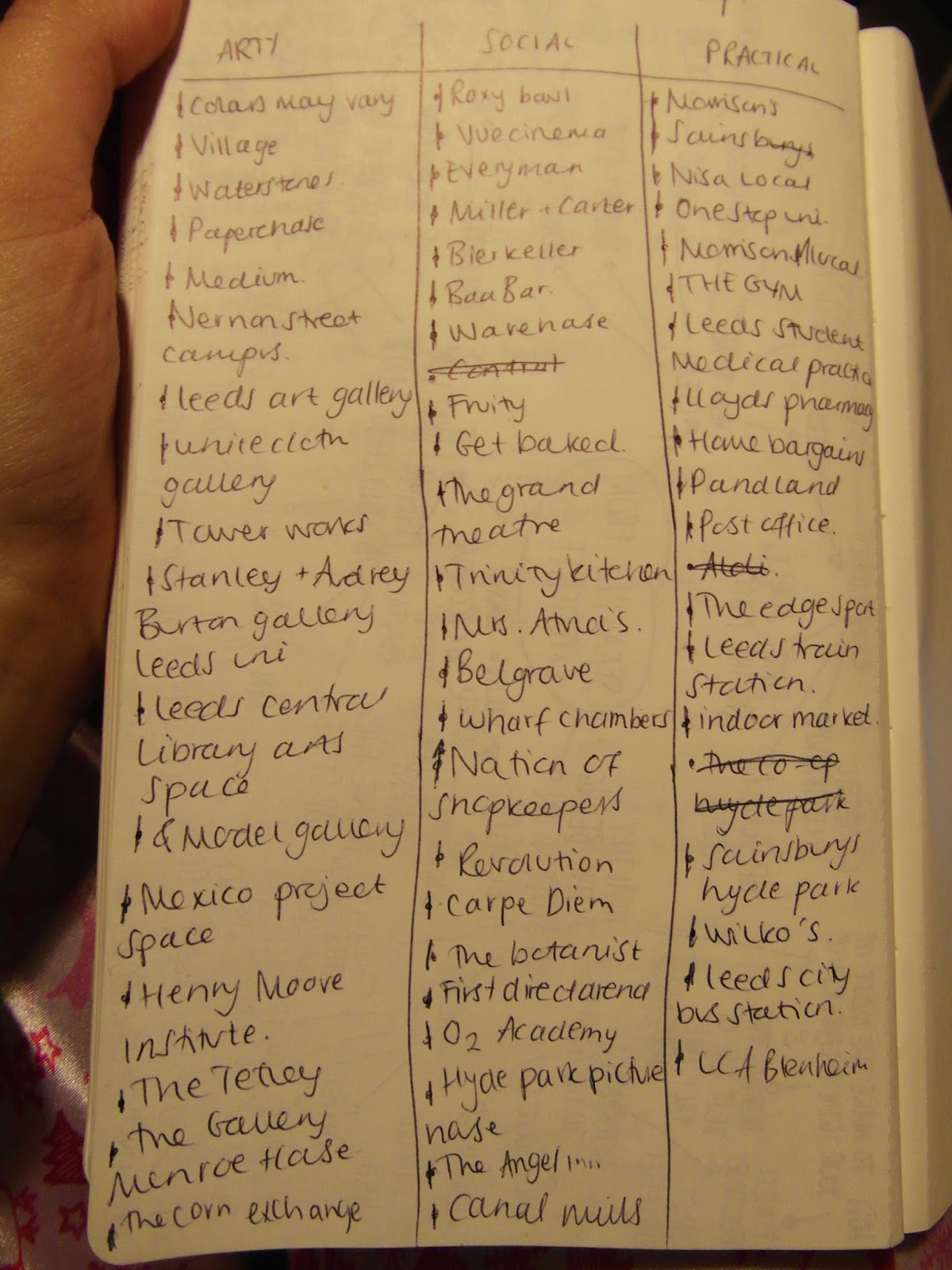 |
| To decide on what places to include, I may a list of places I visit regularly, and would of liked to know about when I first moved to Leeds. I separated the places into three categories, artistic, social and practical. I thought these would be the three most important categories, and also covered most things as well. As well as these places, I will also include landmarks from Leeds such as the Leeds Museum and and Leeds Cathedral as well, just to help people know where they are when walking around the streets. |
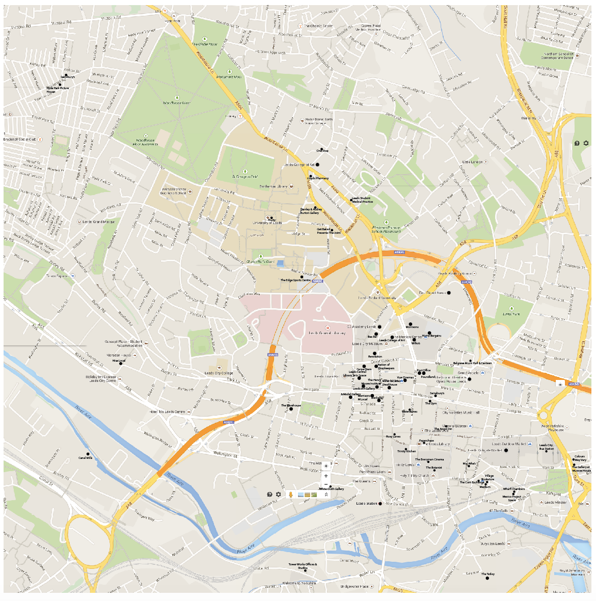 |
| I plotted these places onto my map, using Google Maps to find out where they all are, and then matching up my Google Maps finding with my own map. I have noticed that most of the places are in the centre of Leeds, and only a few in the far northern and western parts of the map, so perhaps I could make the distance smaller and enlarge the rest of the map, making the road names larger and everything easier to read. I think I will also add the student accommodation blocks on as well, as when making new friends from different accommodations, you don't really know where these are, so this would be an easy way to find them. |


No comments:
Post a Comment