After undertaking a vast amount of development into possible colours I could use for my map and making a plan of what places I was going to include, I set about the lengthy process of actually producing my map.
 |
| Using a graphics tablet and the pencil tool on Illustrator I traced round all the roads on my map, at the scale I wanted to print my finish map out at. |
 |
| This is a close up of what part of the drawn map looks like. |
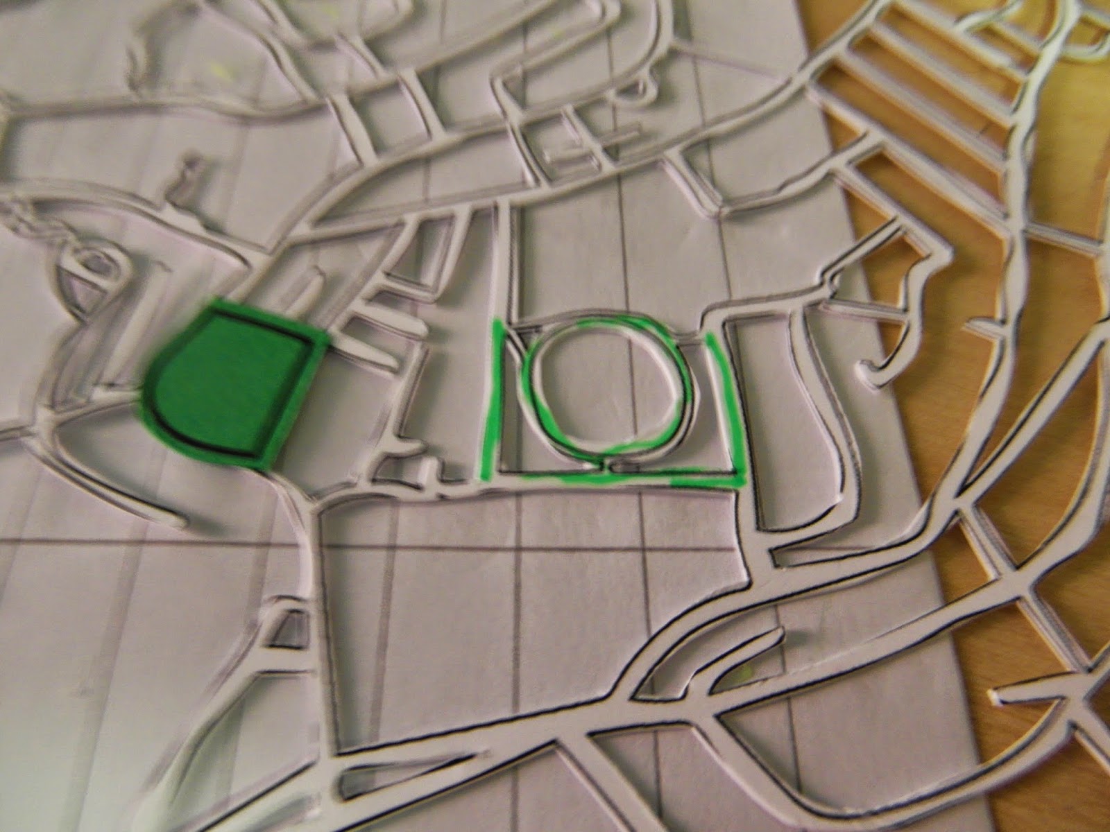
I also drew round the specific places I was going to include in my map, the social, practical and creative places in Leeds. I drew around the water and grass areas as well, so that all these different elements could be printed out on separate sheets of different coloured stock and therefore be represented in different colours on my map.
 |
| Social places. |
 |
| Practical places. |
 |
| Water areas. |
 |
| Creative Places. |
 |
| Grass areas. |
 |
| I printed the full drawn map out onto matte A2 stock which was thick enough so that when I cut it out the stock wouldn't crease or get messed up too easily due to it's stiffness. I used a scalpel to cut out the map, so that I could get the detail I needed. I had originally planned on cutting the map out using the laser cutter but when I came to book as induction I found that the next available one was too late for me to cut it out, which meant that I had to cut it out by hand., which took a lot longer than I expected to. |
 |
| I printed out the grass areas and cut one out at a time, finding where they need to be placed on the map itself, highlighting the area so I don't loose my place, and then adding super glue to the highlighted area and sticking down the grass pieces. I printed the grass on green stock, because I wanted it to reflect clearly the green areas, rather than appear abstract. I thought this would help people follow my map better, if there was some level of accuracy in the colours. |
 |
| Here I had successfully added all of the grass areas. |
 |
| I repeated the same method I used for the grass for the key places and the water areas. The only change being my course friend Hattie helped to cut out these areas for me, to help me get a move on with creating my map, as I was starting to fear I wouldn't be able to finish it in time. Without her help it would of been a lot more challenging to finish my map on time for printing it out. I used three different shades of blue for the 3 categories of places, a slate blue shade, a dark blue, and a purpley blue, which I thought you'd still be able to distinguish between them, but the difference would be sutler. I also chose three shades of the same colour because I thought this would make it easier for all the colours used in my map to look effective together, rather one one colour not really blending in that well with the other, which I may have faced if I used 3 completely different colours. |
 |
| This is my full map with everything stuck onto it from the back view. I stuck the things onto it on the back so that when you turn the map over, to view it the correct way round, there are no ink marks or glue marks, and everything fits in the right place. |
 |
| I drew the title on the back of the map to experiment with sizes and positioning the title, so as not to mark the front unnecessarily. I am going to draw it on the front for the final title though as I think this will be a lot easier to get the lettering right thant rying to write it backwards on the back. |
 |
| It wrote it on the front int he right place, measuring the distances accurately based on my previous sketch, and shading int he bits than need to be cut out so I don't accidentally cut something out I wasn't supposed to. |
 |
| This is my finished cut out title. |
 |
| I did the same thing for the Key title on the right hand side of the map. |
 |
| My map has now completely finished being cut out. |
 |
| For the colour against my title and Key names I simply roughly cut out a piece of blue paper which I wanted to use, and masking taped it onto the back of the map, as it didn't need to be neat as you won't be able to see it at all from the front. |
Photographing my map:
To achieve an accurate and clear photograph of my map I used a DSLR camera from the photography studio to take the photograph, as I thought this would be the best way to get a high quality photograph that would be of a good enough quality to print on A2 scale without appearing pixellated or lessening in quality. I didn't use any specific lighting equipment as I thought if I positioned my map in the right place the natural light would give an even lighting, and I was planning on adjusting the brightness and contrast on Photoshop anyway to brighten up the colours even more.
 |
| This is my final cut out map ready for digital adaptations. My only issue with this photograph is that it is really hard to distinguish between the different shades of blue from such a distance away. This could perhaps be because I didn't light the map using lighting equipment, but relied on natural light which isn't always as bright or as reliable. |
 |
| The different shades are a lot clearer from close up. |
 |
| The title of my map appears clear and bold, using the sans serif hand drawn type. The blue also contrasts nicely against the yellow background of the map, so you can read it very easily. |
 |
| This is a close up of the back of my map, where you can see the real work this map has taken to produce, the cutting out of the different elements and the super glue which has spread out from the places. |
Final critiques:
I got some really positive and constructive feedback when I presented my map at this stage to my tutor and a selection of my peers. People said it was interesting, like an art piece in itself, and that it stands out due to it being hand made rather than digital, especially using a technique first years may not of seen before. Because of this hand made style it was said this makes you want to interact with it, and it's more engaging because of this personal and friendly tactile touch I have given it. This hand made approach would also inspire first years to experiment with bold colours and more practical techniques as well. It was also commented how it was effective I included creative places on the map, and that people liked the range of places I have included too. My tutor commented that my map gives out an aura that will make freshers want to keep it, rather than throwing it away like lots of other posters and leaflets we are bombarded with during freshers week. They also said hat the blue, white and yellow colours I have used are the colours of Leeds, which is something I probably should of known, but the coincidence makes this map very appropriate for the city it is of. Some constructive feedback to work on was that it could be expensive to reproduce, or to reproduce the cut out map itself would be very time consuming. However because I have already cut it out once I have no reason to produce another one unless I was going to present the final product in this very 3D format, which I don't aim to do. Someone also commented that they weren't a fan of the nostalgic kitsch design. It was also suggested that the yellow on white may not photograph that effectively, however I know from previous experiments that this isn't the case, which I explained.
Digital adaptations:
To add the detail and information onto my map I am going to put these on digitally, as I think this will make it a lot clearer to read, and will effectively show the combination of both practical and digital design techniques working together to produce one outcome, which is something I want to show to next years first years, that you don't have to go straight onto the macs, that drawing up sketches and producing work off the macs works just as well. I will adjust the brightness and contrast of my map on Photoshop first to make the colours more vibrant, then adds the road and place names on Illustrator, also the key information and a little introductory paragraph before printing my final map digitally.
 |
| This is my final digitally produced map. I added a short introduction to the bottom left corner, to explain a bit about the map and why I produced it. I chose the right align it as opposed to the more popular left alignment, because I thought it would sit better against the clear side of the actual map, as the actual edges of the map just sort of peter out, that edge isn't as distinctive. On the right hand side is the key, where I have listed each key place that is on my map. To match the two up I have only included numbers on my actual map, and then the corresponding number and name of the place on the right under the key, so it is easy to match what you've found on the map with the key. For the circles which the number are contained within I used the eyedropper tool to make them the same outline colour as their corresponding stock colour on the map, to help the link between the two. However because the rings are so small and the colours on the map so similar, you can't tell the difference at all, they rings just like like one shade of extremely dark blue, which is a shame as this hasn't fulfilled my idea of having colour co-ordinated map and key. For the key body text I used Futura, the same font as all the text on my map, as this is a very minimal yet clean and legible typeface, which makes my hand crafter map look a lot more modern. I made the key body text a medium shade of grey as I thought black text on such a large scale would be too overpowering for the brightly coloured map, and I didn't want to bring it down and bring a dull feeling over the cheerful map. However I sis create my introduction in black typeface, as I thought this would work better as there isn't as much text covering as much space. For the map itself, each key place was shown using a white outlined circle with a number in it which corresponds to one place in the key. This is a simple and easy way to show lots of places on a map whilst not taking up that much space. I also included the names of some important places I didn't want to include in my key places such as Leeds University and the Hospital, which thinking about it I should probably of included the hospital, as this is rather important for students to know about, however at the time I perhaps thought this was more something to put on the map rather than highlight in the key. I also included a fair few road names, most of the key, important ones, as I think this will help students track their way around Leeds if they know a certain place is on a certain road, this will make it easier to locate that place. |
 |
| I found that when I had been glueing the coloured segments onto the map where the key places were, I had accidentally stuck one in the wrong place, as you can see here, where there is just one lonely blue part with nothing to put on it. |
 |
| Here you can see where the segment should of gone, and how similar the gaps were, so this doesn't surprise me I managed to glue it i the wrong place. This does mean though that where Hyde Park Picture House is supposed to be there is no coloured segment, so the number is a little bit hard to read. I didn't want to attract attention though by making it black instead, as I thought this would highlight my mistake. |
 |
| The top is my initial version of my introductory paragraph, however I created my final one (below it) which I thought was more informative and better explain my map, rather than waffling on a little bit. |
Final map:
This is my final map printed out on A2 satin stock, so that it has a slight shine to it, and the colours are brought out nicely, but it isn't overly glossy so the sun reflects off it at every opportunity. I photographed it using the DSLR cameras to get a clean image.
I am really pleased with the outcome of my map, I feel as thought it has achieved my aim of informing new students on key places in Leeds that will be helpful in the main aspects of their lives in Leeds. It is also very aesthetically appealing, so I would hope students wouldn't throw something like this away if they received it during freshers, but would want to put it up on their walls. I think the colours I have chosen, yellow, green and blue, make this map appeal to both men and women, which is something I was really trying hard to aim for, as the brief was to help all first year graphic design students, not just one gender of them.


 |
| Here you can see a slight indication of a shadow on my actual map, perhaps where the sunlight wasn't quite as strong when I photographed it, and you can see the yellow is slightly darker than the rest of the map. I would or preferred an even appearance in colour, however I think this is only a slight irregularity and adds to the hand made aspect of my map. |


No comments:
Post a Comment