I started off by researching into different styles of maps, to see what style I preferred, and which styles were the most legible, as I want my map to look both aesthetically appealing but also be clear and legible as well.
 |
| I like the simple use of colour in this map, only using blue and white, which makes the detail very clear, as this map is quite intricate. It also appears slightly hand rendered, or at least not geometrical and precise anyway, which makes it look slightly less clinical. My only problem with this map is that there are no place names on it, which although it looks ncie isn't really very helpful. |
 |
| This map is definitely hand rendered and is even more simple in colour, only this map has place names discretely tucked into it, which when you first look at it you don't realise they are there, it's only when you look closely to find out they are in there. I quite like how the map is contained within a shape, only this limits the amount of places you can include in it. |
 |
| This is a much more contemporary style map, using block shapes and primary colours to form the shapes. The space within the roads has been filled in with red diagonal lines to create these geometric shapes, which looks really effective, and adds a subtle pattern to the map making it a little less simple, but still extremely legible. Specific places are blocked in in black flat colour, with the name of the place in white, sans serif uppercase lettering. The road names are in the same minimalist typeface only in black, still in uppercase, so they stand out and are readable against the white stock this is printed on. If I was to produce a map like this I think it would work really well to be screen printed, as it is mainly just block colours which never overlap, so lining it up would be fairly easy. |
 |
| This map again is very illustrative, and similar in style to the Hungry Sandwich Club map I produced as part of a team. The map is not necessarily geometrically accurate but does appear to follow the basic shape. It is pretty simple, in that there is a lot of bank space, although the illustrations are quite intricate some of them, although mainly linear. The slight addition of colour highlights details in the main, key places, perhaps this is something I could use in my map, to highlight the most important places on it. |
 |
| This map is rather unusual, a combination of 3D illustration and flat geometric shapes make up the imagery in it, which makes the 3D shapes look like they are popping out from the page, almost like it's been photographed. This map also uses a pretty simple colour palette, which helps to emphasise the Thames River, the main aspect of this map, and lets all the other details surrounding the river blend into one another as a pattern. |
 |
| This is a very complex map of London, using only basic geometric shapes to construct the shape of the map, in different colours to perhaps show different themes of places, or perhaps just to make a pattern of the map. |
 |
| This is a layered paper-cut of some part of the ocean, possibly the arctic. I really like the different shades of blue to show the depth in the sea, it creates a very interesting pattern using very simple shapes, and would be relatively easy to construct as well I think as long as I stuck to a simple design. However I am not sure how I would include the place names and road names, as it would be hard to get them to as small a size as needed through paper-cut, so perhaps adding them on digitally would be the best way to do this. |
 |
| This is another really amazing paper-cut, this time using multiple colours and layering them very differently, so they almost overlap but don't at the same time. It looks as if this has also had some sort of digital addition to it with the birds and the little house at the bottom. The whole thing together, combining the paper-cut and the digital additions, works really nicely and one doesn't look out of place with another, but compliment each other. This is definitely a style I would be interested in experimenting with, as I think this is a different kind of medium I haven't experimented with, and think would work very well in the form of a map. |
 |
| This map is quite similar to that of the London Map previously, using the same different coloured block shapes to construct the structure of the map, only this map has hand rendered street names on it, which makes it a lot more useful, although it covers a much smaller area, so there is more space for street names. |
 |
| This map is very complicated and detailed but also really aesthetically appealing and rich in accurate colours. It's been produced very digitalised, most probably using vector shapes on Illustrator, and appears very rounded and appealing, which may or may not be accurate. This is a style that I find really aesthetically appealing however I don't think my skills on Illustrator could produce something as effective as this in the short time frame that I have. |
 |
| This is The Hobbit book cover which uses a very hand rendered and simple map, using simple shapes and patterns to construct this map, with simple lines to join certain places together. I really like the use of shapes and lines to construct this map, as it gives a texture to it, and also kind of looks like it's been lino printed, with the textures on the block of colour at least. This could be another medium to explore. |
MAPS by Aleksandra Mizielinska and Daniel Mizielinska
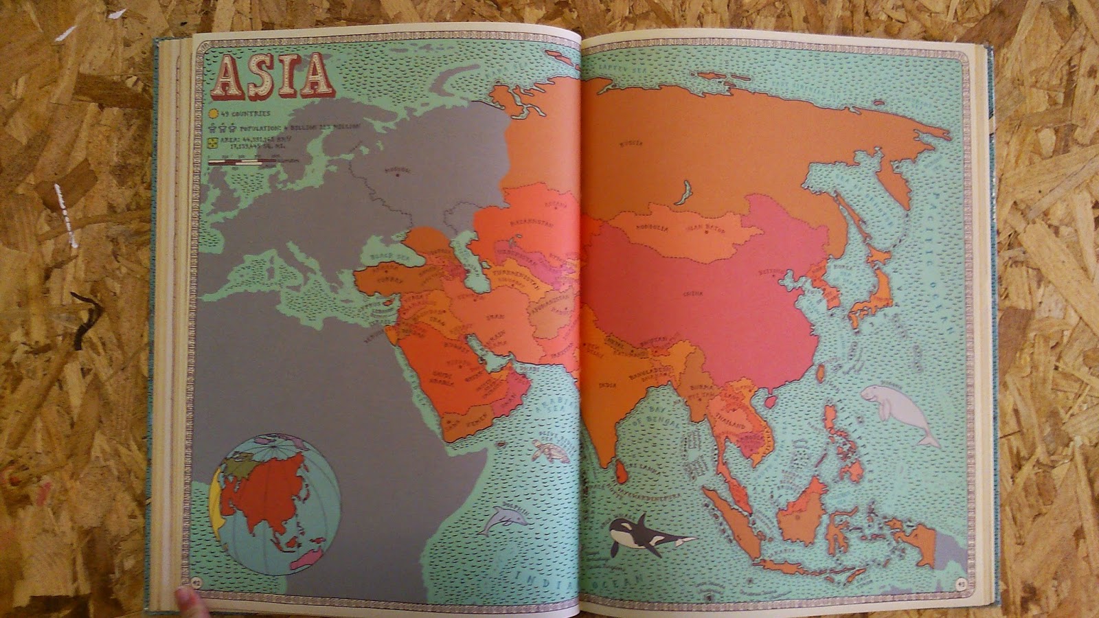
This is a very illustrated map book containing maps from the whole world. I really like the illustrated style of this book, how block colours are used for all of the illustrations, with black outlines around everything. It has a very hand rendered style, and with the use of very earthy tones it creates quite an old fashioned yet contemporary style.
 |
| Different countries are pointed out using lines, rather than on the actual map, which makes it a lot easier to read the countries, but also clears the map up as well so you can have a clear view of the world as a whole without nothing crowding it. The countries that are expanded on in the book are also coloured in their respective colours, for example all the European countries are green, and all the African countries are yellow. |
 |
| Front cover, a snippet form the world map and some of the illustrations from the book. |
 |
| The world map is a lot clearer here than on the contents page, and the full continents are filled in rather than individual countries. Ranging sizes of illustrations frame the outside of the map, another inside view as to what is inside the book. |
 |
| Europe is closed in on and using varying shades of green to distinguish between the countries, perhaps I could use varying shades of one colour to distinguish between the different categories of places. |
 |
| It is all hand rendered, and the typeface used for the places looks hand rendered as well, an interesting serif typeface to match the old fashioned style of the whole book. I like the little pattern of notches to create the waves of the sea, similar in style to The Hobbit book cover, a simple pattern to add texture. |
 |
| Each country has a little description in one corner detailing the basic facts of the country and it's flag as well. |
 |
| Each country has a double page spread to itself with small illustrations of key aspects of the country covering it, which this is used to illustrate the country itself and what it has to offer. |
 |
| Some countries have little details such as these trees in it, which add a characteristic to the country specific to it, especially the type of trees which are illustrated as well. |
 |
| Some have illustrations around them adding more detail, and most of the illustrations have little hand rendered style captions around them, describing why they are there. This could be something to include around the outside of my map, key tips and tricks for living in Leeds accompanied by illustrations if I have space. |
 |
| The illustrations are often simple in colour and shape such as these mountains, when put together create a really interesting pattern which could be used for the back of the map maybe. |
 |
| The illustrations style and colour are specific for each country. |
 |
| Some countries have close up sections, to look closer at tiny islands so you get more detail. This could be useful for a part of Leeds that has a lot of detail in a small area. |
 |
| Each continent is the same colour as on the world map at the start, so it is easy to link the two together. Each continent page also has a small world map in the corner to show where the continent is in relation to the rest of the world. |
 |
| As you can see little tips about specific locations in the map are included, alongside illustrations as well, keeping in with the theme of the map. |
 |
| America is split up into it's different states, as this is a key part of what makes America America. Similarly to the countries in the continent maps, they are different shades of the same colour, so you can better distinguish one from another. |
 |
| Back cover. Very similar to the front, with the the text kept within the confines of the map. |
This research has been really useful to me, as it has showed me the different styles of maps that are currently out there, and has widened my view on the mediums I could produce them in. I think the next step is for me to experiment with some of my preferred styles on a small scale and see which one I think looks the most effective but also takes a reasonable amount of time as I don't have very long to finish this brief.


No comments:
Post a Comment