Following on from the feedback I received from my peers and tutor, I made some changes to my leaflet to improve it.
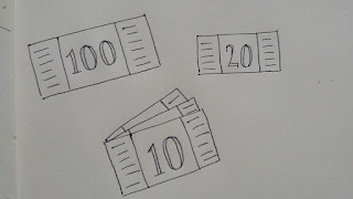 |
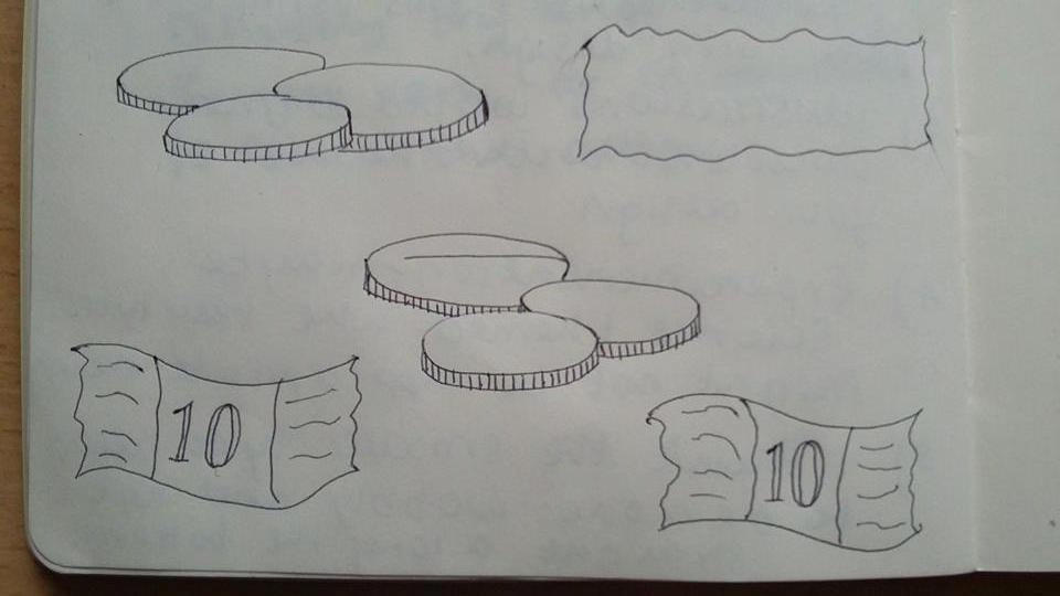
| I sketched out some coin and note illustrations to see which is works better drawn, and I have decided to go with the note option in this bottom photograph in the middle, as it looks clean like all the other illustrations, but is uncomplicated and reflects payment nicely, more notes being shown behind the initial one. |
 |
| I applied the teal gradient to my leaflet, creating each square a darker shade of the original colour to show the build up of ideas you undergo in the design process. This looks a lot more professional and the colours work very nicely together. I created the tab the same teal colour as one of the stages, so that it all fit in nicely together colour-wise, and contrasted against the white of the title page. |
 |
| I decided to create the feedback arrows a shade of beige from before, as I didn't want to completely disclude the colour, but to have it highlight small aspects such as the arrows and underlining the title as well. |
 |
| I changed the shape of the arrows and some of the information int he leaflet so that when it is closed it won't be able to be seen, but hidden behind the flap in front of it. I also made the text on "continuous feedback" beige as well, to unite it more with the arrows, however this makes it quite hard to read, being so close in shade to the bacground colour. |
 |
| I changed the "continuous feedback" text back to black, and you can see the notes have also been added to the final stage as well, completing the leaflet nicely. |
 |
| Looking at the new accordion fold on one of my previous mock ups, I found that because the fold doesn't wrap around, the leaflet actually sits relatively flat, and the top page doesn't stick out like the wrap around fold. I decided that the tab to secure the leaflet was unnecessary, and when i tried it with the accordion fold, the left side stuck out as it was being forced at an angle it didn't naturally sit at, due to it not having one clear spine fold, but several on either side. I therefore removed the tab from my design. |
 |
| I also changed the gradient on the back illustrations to reflect the new colours. I used four of the colours from the front of the leaflet, which started off the darkest on the left, as this would be the colours visible next to the starting colour when closed. I also used two shades of beige to incorporate this colour into both sides of the leaflet subtly, so it doesn't take up as much dominance as the teal. |
 |
| Although my peers commented that the illustrations on the back were an appropriate size, I still thought they looked a bit big when folded up, so I created a new pattern, adding in the lightbulb illustration, and making all the illustrations smaller, with a 0.8mm stroke weight. On the screen it does look quite small, however I think when I print it out on A2 stock the sizing will be right. I also made sure I included the leaflet title on the right, creating a white box behind the text with a lower opacity so the illustrations can be seen through the box, but they aren't as bold as at full opacity, making the title easier to read and not getting lost amongst the illustrations. |


No comments:
Post a Comment