It takes a long time to produce and design the shape of writing, and there are three different categories of writing, lettering, calligraphy, and typography.
Lettering
Drawing lettering. Craftsmanship. Industrial lettering. Digital lettering - instagram logo - hand drawn lettering digitalised. Digital is more more accurate.
Calligraphy
Penmanship - writing letters rather than drawing them. Manuscript letters.
Typography
Bringing lettering and calligraphy together. Johannes Guttenberg created the first movable type. This allowed books to be printed. For text - calligraphic look a like. Display type can be in more whacky, elaborate, flourished forms. Type as identity - London Underground. Type as a system - Univers. Global type - Dalton Maag involved in the production of typefaces for the global market, such as the Nokia typeface, produced in a variety of languages.
Dalton Maag...
Produces library fonts, which students can use for non commercial work for free. They also create Chinese fonts occasionally, as it is a massive undertaking with around 60,000 characters.
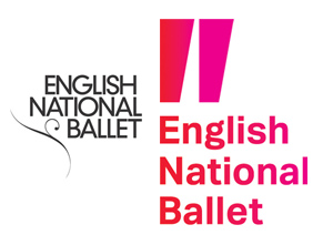
Produce logo refinements, such as for the English National Ballet, they creates a double story "g" and lessened the weighting. They also refined the Saxony Hotel in Miami.
 |
| Original on the left. Redesign on the right. |
Produces font modifications, which tend to be from their own font libraries. Examples of this are BT Vision, Samsung Galaxy, which a single story "g" was created along with punctuation for Samsung interface, and also Virgin Holidays, where new weights were created.
Produces custom fonts from scratch, which is the biggest part of their brand. Examples of this are Nokia, Intel, where a slight bevel on the letterforms was created, Rio 2016. Custom fonts range from taking 2 years, such as Nokia, to a few months, for Samsung/BT to produce, however it is an ongoing project.
 |
| Rio 2016 custom font. |
Workshop
The workshop task was to choose an example typeface, without knowing what it was called from a selection of Dalton Maag's fonts, and using the letterforms that were given, to create the word Hamburg, based on what category of sans serif the example letters are, which can be found out from analysing the example letterforms and comparing the characteristics to the category characteristics.
 |
| Typeface example that was chosen. |
 |
| Close up of the word, you can see there is a slight overshoot. |
The actual typeface which we found out afterwards was called Tondo, and it was useful to compare the typeface I had drawn to the actual typeface, to compare and contrast, and see where I had gone wrong and what aspects were accurate.
This workshop was really interesting to try something different, and it makes you think about the typeface a lot more when you're drawing it, and recognise all the tiny aspects you wouldn't if you were just looking at it on a screen.


No comments:
Post a Comment