 |
| The previous idea was attempted in reverse, however as you can see you can't read the text well at all. |
 |
| White text was used instead of black, which does give it a more muted appearance, however the white text adds to the femininity. |
 |
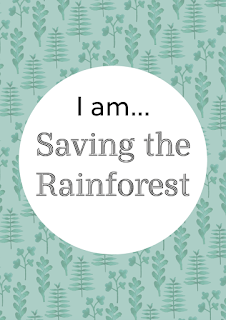
| A more green shade was used, which does make it look slightly more neutral, but I can't unsee the wallpaper. |
 |
| The coloured fill was applied in reverse to see if this would make it look less feminine, however it just made it worse as there is more pattern and more colour. |
Feedback:
I felt really stuck with the poster design, as I want to incorporate the leaves, however how I've done it has made the poster look feminine, and I'm unsure how to fix this.
Instead, I asked my peer what they thought of the designs, and they really liked the second one down, the first circle frame design. Looking back I do agree, it doesn't have the same femininity the others do due to not having a fill, and the circle makes the text really bold.
This is the design I will print out to go alongside the guides.


No comments:
Post a Comment