Following Studio Brief 1, my theme I was given was "social", so my task was to adapt Garamond, my chosen typeface, to appear more social. I decided that firstly I should create a mind map to gather ideas on how to undertake this brief.
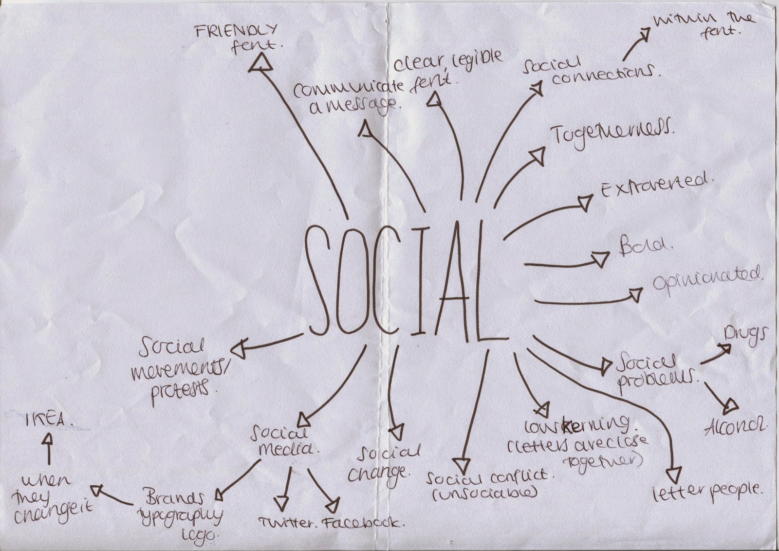 |
| I came up with several ideas you can see here such as social movements/protests, opinionated, bold, togetherness and social connections. |
 |
| This is the original Garamond typeface that I am going to adapt. |
 |
| I firstly tried to manipulate Garamond in several ways on a small scale, which I found was too small to effectively change it in a detailed way. I tried changing the weight to appear more like how you'd write the letters by hand, I also experimented with outlines and bold serif's. However I found I needed to work on a larger scale. |
 |
| On this design I have rounded off and shortened the serif's to make it appear more friendly. I have also rounded off the whole letter as well, such as the top of the "A". I have also made the top half of the "e" come down further, as before it was quite short and looked a bit intimidating. I also made the rounded part of the "a" more circular rather than oval and downward facing, so that it looked more friendly again. |
 |
| This design is very similar to the previous one, the main differences are that I have made the weight of the letters a lot heavier to make it even more rounded and friendly. I feel this is more successful than before. |
 |
| Here I have elongated the serif's to make them almost touching, as social people like to be surrounded by people, and close to people, so I tried to make the letters closer. I elongated the top half of the "e" even more as well. I really like this typeface, I think it works very well, however I'm not sure if it would be too complex for body text due to the length of the serif's. |
 |
| Here I have added balloon's to make it look like a party is going on, as sociable people like a good party. I also chose to make the letters have quite angular serif's, which I don't really think is that effective, as it contrasts with the roundness of the balloon's, and doesn't really appear that friendly. However the balloon's work well, but possibly not for body text, due to their complexity. |
 |
| Here I have experimented with an outline on the letters, to make it appear bold, keeping the rounded qualities of the letters. I think this does work effectively and could definitely work as body text, however it doesn't scream social, the theme isn't that clear. |
 |
| On this design I have made the letters out of exclamation marks, as typically social people are quite loud and out spoken. I have still kept the shape of Garamond in it's rounded off form, but again shortened the serif's to make it appear more friendly. I think this works quite well, however I'm not sure how well it would work if I blocked in the letters, making the exclamation marks black, or if it works only in outlines. This is something I would need to experiment with. |
 |
| Here I tried to exaggerate the roundness of the letters even more so. I think that the "A" looks kind of like a spaceship, which was unintentional, but I think it adds a quality of humour to the letters, which is appropriate for my theme. The "e" is also kind of wonky, which I think makes it look drunk, which could be a development for this typeface, making the letters slightly wonky, as when being social, people sometimes get drunk and are kind of unsteady. |
 |
| Here I have elongated the letters because social people like to be top of the social sector, and be higher up than everyone else, so they know and can see everything. This is only my personal opinion of course, not every social person is like this. I have still tried to make it rounded, but in elongating it, it has become thinner, and therefore naturally looks harsher. |
 |
| In this design I have changed the weight of the letters so that it more closely matches how you would write each letter by hand, as for example in a "y" the descending part of the letter would be lighter than the main part, as you're finishing off the letter. I'm not a massive fan of this design however I feel it looks a bit clumsy, and I don't think the serifs on the "E" work at all, as it makes it look kind of frumpy and like it's trying to be traditional when this design isn't traditional at all. |
 |
| On this design I have added eyes into the eye of the "e" and the counters of the "A"'s. I have done this because sociable people like to see everything and know everything, of course this is stereotypical. I think this works quite well, however it does look kind of morbid, like something that should be an advertisement for hallowe'en. I have made the "A" even more chunky, and should possibly do this even more so for the "E" as well so that they match in weight. I think this added weight works really well as it looks a lot more bubbly and round. |
 |
| Here I have made one of the edges of each letter into a bottle, with the label of a different kind of alcohol on each of them. This is because when people socialise, sometimes alcohol is involved. I think this adds a funky element to my letters, and also a bit of imagery as well, to help convey my theme better. Although it is subtle, so could work as body text, however I don't think the names of the alcohol would be visible, however the bottles would be, so this wouldn't be a problem as such. |
 |
| Here I have added cake illustrations to one part of each letter to suggest parties, as cake it often involved in social events. I think this adds an interesting dimension to the letters, whilst still very clearly keeping the shape of the rounded Garamond font. I like how when the cake touches the baseline I haven't made it into a serif, as this emphasises the difference between serif and no serif. |
After presenting the above typefaces to a group of my peers I got some really interesting feedback. Someone said that I should try making my letters lean into one another, for social support. Or to suggest drunkenness. I think this could prove to be a really interesting design, one that is simple but effective and would work really well as body text. My peers also suggested that I should make my letters really fat with very small counters, and then made to look like a whole cake with candles on the top, possibly also with balloons. This sounds like a really fun, interesting idea with excellent imagery. It also develops on from my previous cake idea. They also suggested I should make the letters appear to look like balloon animals using sausage shaped balloons, such as the kind of things clowns make at children's birthday parties. They also suggested the idea of a social smoker, so perhaps I could do something with smoking imagery such as cigarettes or smoke.
 |
| Following my critiques with peers, I produced this wonky design, where the letters appear to be leaning against one another wonkily for support. I really like this design as it's fun and legible and will work well as body text. |
 |
| I also tried the idea of making the letters look like cakes, which I am really pleased with. I also used the elongated serif's on the "E" and I think this adds tot he gooeyness of the cake. I could however make the counters even smaller and the weight a lot heavier, to make it appear rounder and more cake-like. The candles also give it a fun look, but perhaps are an added extra than is unnecessary? |
 |
| Here I have added balloons to the previous design as this was something suggested in my critiques. I think this just makes the image over complicated and it works a lot better without the balloons. |
 |
| Here I have simply filled in one of the letters from the cake design to see how it would look just one colour without all the detail from the outlines, and if it would still be recognisable as cake. I think it is actually really effective and he candles work a lot better in this design than the previous cake design, as they seem to fit in better, and also help to make this look like a cake rather than just a blobby "e". |
After all this designing I feel I have produced some effective designs that I can work on further this next week to perfect. I will definitely continue on with the cake idea and also the wonky idea too, as I feel these are two of the more effective ideas. I may also try and develop some more of the ideas suggested by my peers as well.
After all of this designing has been done I must choose 10 different designs I feel work the best and perfect them to be presented on Friday.
No comments:
Post a Comment