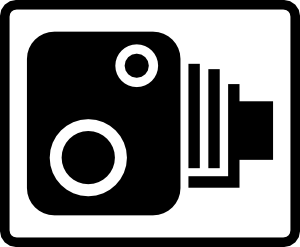
What's the difference between a sign, symbol and a logo? You can have app icons on your phone, or the Android logo, or the camera symbol on a speed camera. But essentially these are all the same things but with different jobs.
 |
| Fire Exit sign. |
The first thing me and my group did was come up with some initial sketches of ideas of imagery we could use on the sign. We thought that we should stick with the main colour being green as this has connotations of safety, at least in England anyway, and that we definitely shouldn't use red as this has connotations of danger, which is the opposite effect we want. We also discounted using text as it would only be useful in specific countries who speak that language, and would have to be adjusted for each language, which would be costly.
 |
| This was my initial idea that came to mind when I thought of fire exit signs, of a simple woman with fire behind her, as this is what you think of when the fire alarm goes off, running away from a fire. |
 |
| We then thought about having a sign with a lit up door as the only imagery in it, with the walls red and the door green, to suggest that you should go through the door where you'll be safe. The colours could also change depending on where the fire is. We thought about just a simple door shape sign with an arrow in it showing the direction you should go in to get outside, however this is a bit too simple I think. We then played around with the original design with the door and an arrow, although this is really similar to the original design. We thought about including other symbols, so you read the symbols to give you an action of what to do. Here we included a fire symbol, although we discounted this idea as you might have to exit because of things other than fire, such as gas or burst pipe. |
 |
| Following on from the last idea on the previous photograph, I tried adding smoke to the fire, but this didn't really work. I then tried a skull and cross bones, however this looks more like the sign for poison. I then thought about the no entry or don't do it road sign symbol, to represent something bad, however I don't think this conveys a strong enough message. I experimented with the fire symbol again, as I think this is quite effective, but doesn't show the right message. I also experimented with the man on fire design too, but this just looks like the person is actually on fire. |
 |
| I experimented further with the man on fire design as I couldn't get it out of my head, and I think I have come up with some good ideas they're just not brilliant. We then thought that all these visible signs were effective, but what do blind people do who can't see the signs. We then thought we could include some sort of sound into the sign, perhaps a musical siren coming from the sign to direct the person to it, or a Classical FM calming voice saying to move towards the emergency exit, so as not to scare the person. We also thought about adapting the current existing sign in the way the man is presented, as in the initial sign the man is running, and as a child when the fire alarm went off you were always told to walk not run so as not to cause chaos, however the sign goes against this. We tried to create a walking person, by straightening the legs and widening the stride, which I think is an effective yet simple modification. |
This is our final fire exit design we have came up with. It is only a quite draft as we only had the afternoon to do the whole task.
 |
| We changed the running man to a walking man, and made the arrow go into the door, to show you have to go through the door rather than just up to it. The rest of the design is exactly the same as the original. We included a little microphone symbol in the corner to show that there would be sound coming out of it, and we also made it rounded to make it easier to be seen from all angles, because if the sign was flat, if you were right at the side of it you would only be able to see a green blur, however with it rounded you'd at least get to see the side of it. |
Considering the current fire exit sign is pretty much perfect, and there's not much you could do to make it any better if you spent years on it let alone an afternoon, I feel as a group we have managed to achieve a pretty good result.


No comments:
Post a Comment