To start with my research for photo frames backing paper I visited several shops in Leeds that sold photo frames and photographed different styles and layouts of back paper. These are the results of such research.
Initially I went to Bargain Buys:
 |
| This is a cute little love heart frame, with red backing paper which represents love in it's colour. There's an illustration of a key on it, which may suggest unlocking of the heart. It also had the dimensions of the photo frame on it, and "finishing touches" half in a script typeface and half in block sans-serif capitals. The colour scheme is red and gold which is a very romantic colour scheme, and works well with the wooden frame. |
 |
| This frame uses a grey/silver colour scheme, similarly to the colour of the frame itself. The typography is very similar to the previous frame, except instead of block capitals a typeface that looks more like Times New Roman in lowercase is used. The dimensions are right at the bottom, rather than central, and give the added information the frame has to include. |
 |
| The backing paper for this photo frame is very different as it's a massive wooden love heart with lots of individual holes for photographs all different sizes. The theme of the photographs is all the same however, featuring happy families in a black and white, giving it a perfect families kind of appearance. |
 |
| This is a very simple photo frame, with a classic white boarder and purple background, trying to make it look rich and more expensive than it is. The metal it's made of is in an arch across the top half with a little intricate simple design below it almost underlining it. The dimensions are again at the bottom, a necessity, not contributing to the design at all. This time the 5" x 7" is a lot bigger, to help people find the right size frame quicker. |
 |
| This photo frame has a lovely photograph of a mum and her daughter it appears, in bright full colours. What's unusual is that this photograph doesn't take up all of the backing paper, it appears almost to be framed within the frame itself, with information about the frame underneath the photograph within i light brown boarder. There is quite a lot of white space here, but the yellow of the swimsuit and the blue of the sky really stands out. |
Next I went to Wilkinsons.
 |
| This is a very simple backing paper for one of Wilkinson's picture frames, which uses circles a lot in it's design. It also uses a simple sans-serif typeface and mainly lowercase lettering as well. This adds to its simplicity and minimalist appearance. It also uses pretty neutral colours, such as grey and pale yellow, so that they can use the same backing paper for all of that range of photo frames, which cuts down on costs and helps to make them look like a unit. |
 |
| This is another Wilkinson's frame, although this frame is a clear clip frame rather than a photo frame. The backing paper still uses circles as it's main design, only this time they are colourful, perhaps because all of the frames don't have any edges to them, so they can use colour and it won't clash depending on frame. I like how the frame size fits inside one of the circles, as this frames the information itself, and is a good use of space. The same typeface is applied to this backing paper as the previous backing paper, with the phrase "no fuss" in purple to give it a bit of interest and to make it look a bit funky, in keeping with the colourful theme. |
I then went to an interesting, kind of bohemian style shop called Evolution.
 |
| These photo frames are all joined together, and have the same backing paper in each frame. It is black and white and has a photograph of a tree's silhouette in the centre of the page, that looks like it has came directly from Africa. All of the information is inside of the tree shape, and it even includes that these frames are made from sustainably sourced wood, which suggests at the environmental ethos of this shop. |
 |
| There is a space for a photograph inside a bird house, with the doors like shutters opening. This is an unusual background as the backing paper looks like wood, in fitting with the frame. The typography is also script style and not very bold at all, as you have to get close to the frame to open the shutters, so you don't have to be able to see the frame from far away in the first place. The only information on this backing paper is the products name, so "photo frame" and it's dimensions. |
 |
| This backing paper looks like a postcard, with several stamps on it. There isn't any information on it, only cute little illustrations in an aged shade, an envelope sent from ages ago. |
 |
| This is a very simple backing paper, with a photograph of a couple kissing, on what looks like to be their wedding day. This gives the buyer an idea of the kind of photograph they could put in this frame, and that it isn't an impractical size after all. The dimensions are printed very small in the bottom, and you can hardly notice them due to the shade of the photograph in that part. |
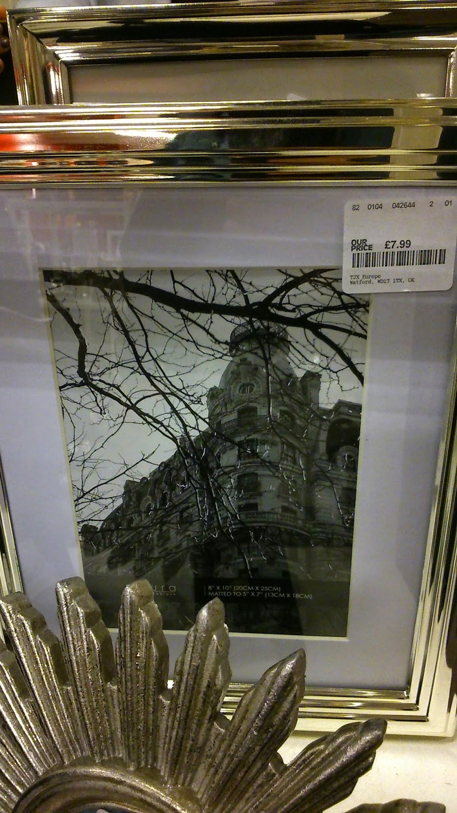
The next shop I went to was TKMaxx, which proved to be plentiful when it came to photo frames.
 |
| This photo frame is very striking. It has a bold black and white photograph of a woman as the backing paper. The woman almost looks like a Victorian portrait, and fits the oval shaped gold frame very well. The line of photo frame is at the bottom, so that the woman takes the main focus. |
 |
| This is an unusual backing paper for a photo frame as there is no text on it at all, nothing to say it's dimensions or the make. There is simply a very beautiful, bold painting of leaves. This makes the photo frame look very attractive, and will draw people to it, however it gives no initial information for the buyer. |
 |
| Similarly to the backing paper above, this is a very striking photograph, and shows that this style of image would work really well in this frame, however there is no key information on the front to show what size the frame is, or what make it is. |
 |
| This is a funky little frame, with the pattern on the backing paper matching very well the frame itself. The design looks like it's from the art deco era, and has room for the brand of frame and information as to the dimensions. The space in the top half of the pattern leave room for the logo, and also acts as a frame itself around the logo. |
 |
| This is a very simple backing paper, with the black background really bringing out the white logo that takes up the largest part of the backing paper. The dimensions are small at the bottom, so they're there, but what you really look at it the brand name. |
 |
| I thought this photo frame was awesome, it made me think of peacocks. It also has a bohemian style, which matches the image of random frames as the backing paper. Similarly to previous photo frames from TKMaxx, there is no information as to the dimensions on the front of this frame, which may be the reasons someone doesn't but the frame. Also the frame itself it so bold you'd need a really striking backing paper to sell this frame, so the backing paper stands out rather than the frame. |
The next shop I went into was Debenhams, which provided a wide range of different styles of photo frames.
 |
| This photo frame has a rather large illustration on it that frames the right hand side of the backing paper, and which looks rather similar to the frame itself. All of the key information is at the bottom of the backing paper, and there is rather a lot of information, a lot more than most other photo frames. |
 |
| This shows how a backing paper can be applied to a group of photo frames, The same diamond pattern has been applied to all four photo frames, only in the bottom right frame there is all the dimensions for each of the frames, as they are all different sizes. There is also a bit more information as well, the same amount as the previous photo frame. |
 |
| This photo frame is very interesting and gothic, and the backing paper reflects this. The backing paper is simple, with a black background, and yellow type. The brand name uses a very punchy, handwriting style typeface, and the rest of the text uses a simple sans-serif typeface to make this backing paper very simple, allowing the frame itself to stand out. |
 |
| The backing paper in this photo frame matches very well the frame itself, as the frame has two birds at the top, and the backing paper has two birds in the centre, in almost the same position as the frame. The oval shape of this frame also gives the birds a loving touch, making any image you put in it look affectionate. |
 |
| These photo frames all work as a unit as they are being sold together, and use a bird design that incorporates both free birds and birds in bird cages, also butterflies and other living things as well. This makes these frames appear natural and earthy, which is also reflected in the colour of the frames as well, as they all use quite green, earthy tones. The dimensions of all of the frames is in the central, largest frame, so that the information is all grouped together. The backing pages are all black and white, perhaps to save money or to make the frames stand out instead of the backing paper. |
I then went to House of Fraser, which is very similar to Debenhams.
 |
| The backing paper on this frame makes the dimensions the focal point, which is the first frame I have encountered that has done this, without the use of any other illustrations. It is very minimalist, as the frame itself is very simple, and the only colour on it is the price and the brand of photo frame. |
 |
| This is possibly one of my favourite photo frames, created for the brand Shabby Chic. The glass is patchy and looks worn, and the backing paper has a design on it that looks like it's from the Victorian era. The colours on the backing paper are neutral and pale, with the detail coming in the design of the logo. The dimensions are very small and at the bottom of the backing paper, so you hardly notice them. The typography of the logo is a classic serif typeface, that adds to this photo frames old fashioned style. |
 |
| This frame is one of House of Fraser's more basic frame collections, and simply states the type of frame it is in a basic sans-serif typeface and then it's dimensions. The brand logo is in the bottom right hand corner, acting as a full stop to the backing paper. This design is very basic and plain, but gets across the information simply and easily. |
 |
| This is backing paper for a Vera Wang for Wedgewood photo frame. It includes very little information, only the fact that it's Vera Wang for Wedgewood in fact. The photograph as the backing paper is splendid though. It makes the otherwise quite ordinary photo frame look like it holds class and money. The colours also reflect wealth as well as they are rich, bright colours, rather than being monotone and neutral. |
Going to all of these different shops and photographing and analysing different photo frames and their backing papers has been really useful for me, to get an idea of what i already out there in the market, and the different styles of backing papers there are, some that include only type and others only image, and some a combination of the two. It has made me realise the importance of dimensions on a photo frame, so I must consider carefully where to place these alongside my photograph. Otherwise this research has been of great use to me.
No comments:
Post a Comment